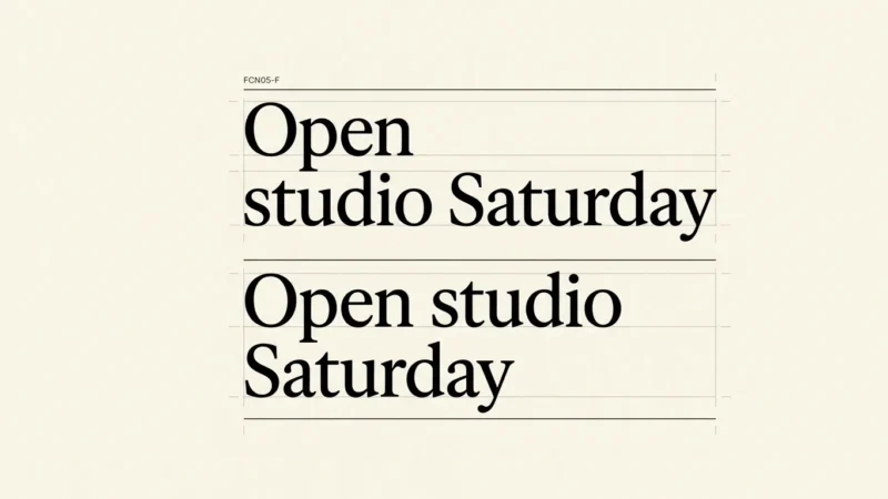
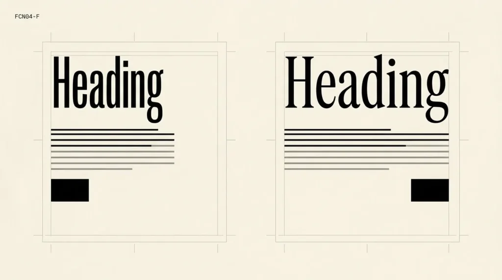
Font fallback and layout shifts are related when a page first shows one font and then replaces it with another that occupies different space. A heading can gain a line, pushing the content below it downward. Check the page during loading as well as after the final font appears.
Affiliate Disclosure: If you buy through links on our site, we may earn a small affiliate commission to help support the blog – at no extra cost to you. It never influences our product selection process. Thank you!
- Font Fallback and Layout Shifts: Why Website Text Jumps as It Loads
- What a fallback font does
- Why the page can move when the font changes
- Choose loading behavior with the fallback in view
- Compare the longest content in both faces
- Check a fresh load and a missing-font state
- Save a loading-state typography reference
- Check whether a font swap moves your layout
- Frequently asked questions
Begin with one affected heading and its surrounding layout. Compare a fresh load with a repeat visit, then test what happens when the intended font is unavailable. Keep a record of the text, screen width and loading conditions. A screenshot taken after everything settles can miss the behavior you need to fix.
What a fallback font does
A website can name a preferred font followed by alternatives. MDN’s font-family reference explains that the list has an order and should include a generic family. The browser needs a usable choice when a named font is unavailable.
For a design handoff, include a fallback specimen alongside the intended typography. Set the same long heading and paragraph in each candidate, at the same width and size. Look at line endings and the height of the text block, as well as the general style.
A font can also lack a required character. Font selection can continue through the list for that character. Add names, accents and symbols that belong to the actual site language; a short English placeholder may conceal a mixed-font result.
Why the page can move when the font changes
A replacement font may fit a different number of words on a line. If a headline changes from two lines to three, review the position of the image or button immediately below it. You can then describe the problem in terms of a visible element rather than saying the whole page feels unstable.
Google’s guidance on layout shifts identifies web-font swaps as a possible source of movement. It also notes that invisible text can occupy fallback-font space before the web font appears. Hiding the initial letters does not necessarily remove the later layout change.
Confirm that the font change and movement happen together. Images, inserted banners or other content can also move the layout. If a heading keeps its position while a late banner appears above it, investigate that insertion before changing typography.
Choose loading behavior with the fallback in view
The font-display descriptor controls how a downloadable font participates in rendering while it loads. With swap, fallback text appears after an extremely short block period and the intended face can replace it later. With optional, there is no later swap period.
That creates a design decision. If an optional font misses the initial opportunity, readers may continue with a fallback during that visit. Review whether the fallback is acceptable for the essential content, including headings and navigation. Do not approve the setting from the final branded view alone.
Record the loading policy in the site handoff. Ask the developer to explain the chosen behavior and demonstrate a fresh load. Avoid treating a keyword change as a universal fix for every page that moves.
Compare the longest content in both faces
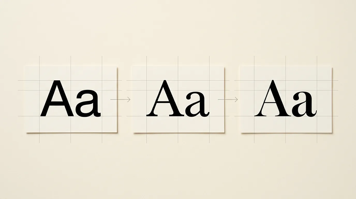
Collect a long article title, a navigation label and a button label. For the title, include the narrowest layout where it appears. For the button, include enough wording to expose a wrap or a cramped control.
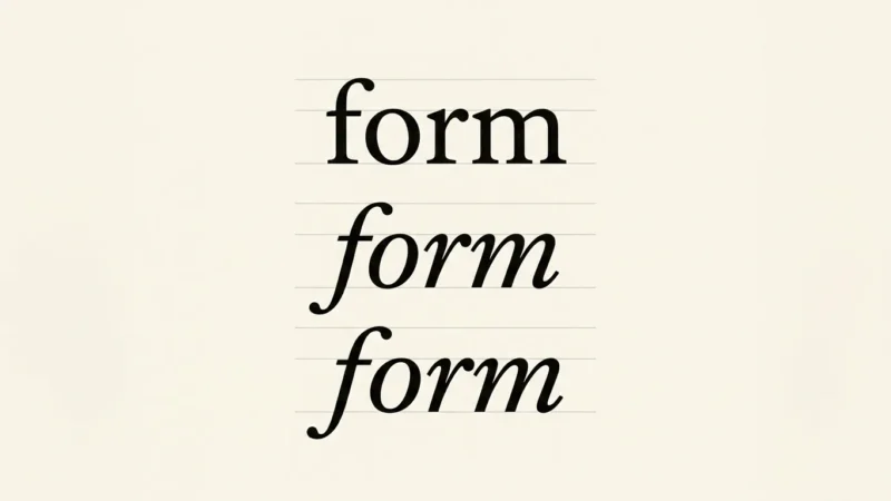
Make a comparison sheet with the intended face and proposed fallback using the same settings. Note the line count and any clipped content. You can review this sheet without measuring every glyph, then ask the developer to investigate a more exact match where the difference causes trouble.
Google’s font best-practices guide discusses reducing differences between fallback and web fonts. It also describes metric-adjustment tools. Check metric adjustments against the specimen; values copied from an unrelated family can produce another mismatch.
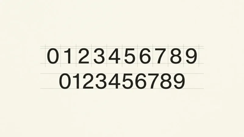
Keep character clarity in the review. A close match in width is useful only if readers can identify the text. Use the legibility checklist for essential numbers, names and codes.
Check a fresh load and a missing-font state
A repeat visit may use a cached font, so ask for a test that exercises loading again. Browser developer tools can help inspect font requests and simulate slower conditions. Record the conditions used so the next check can reproduce them.
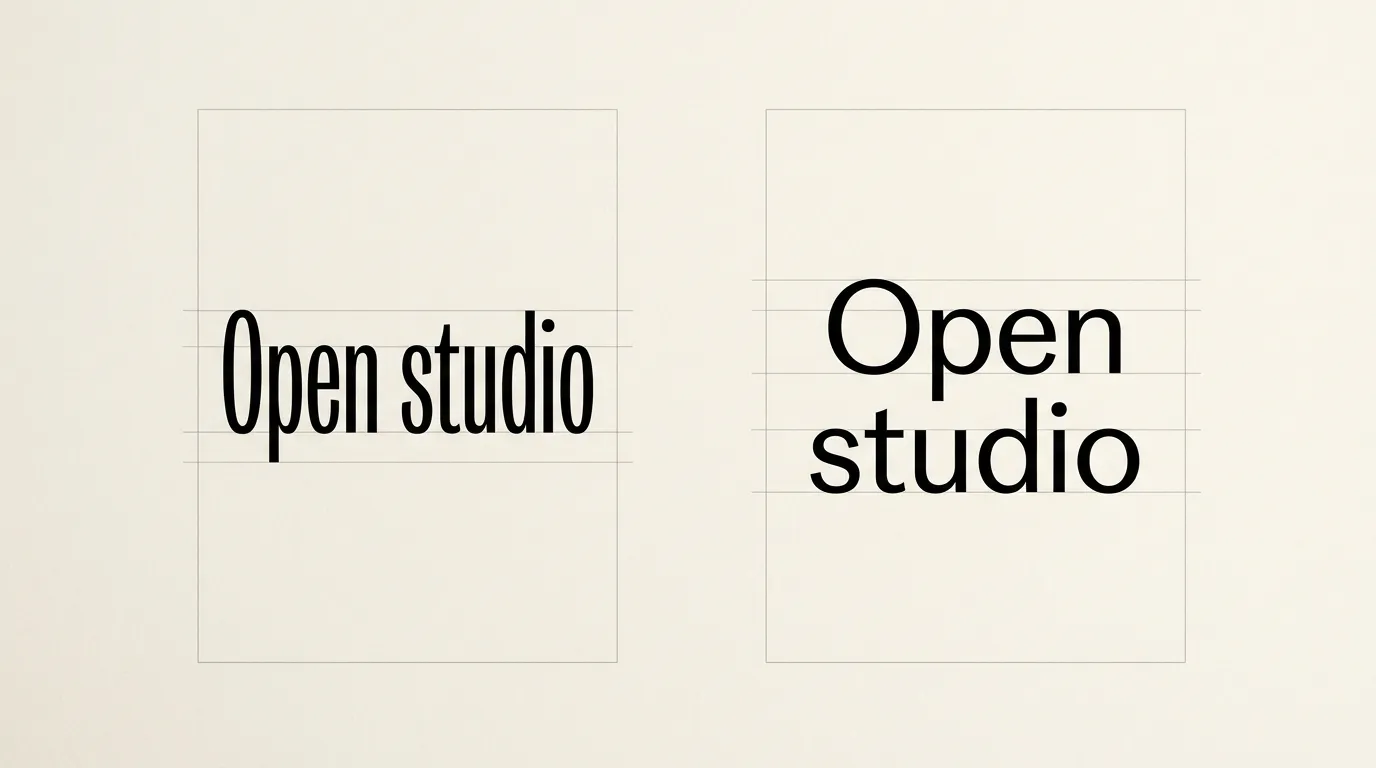
Watch the title, its line endings and the content directly below it. A short recording can make a brief swap easier to discuss than two screenshots. Then review a state where the intended font cannot load, using a controlled development test.
For an editor or designer handing off the issue, supply the page, affected text, viewport width and observed movement. Include whether it occurs on first load, repeat load or both. The developer can use those details to reproduce the movement.
Save a loading-state typography reference
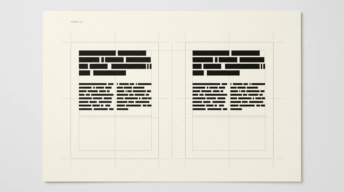
Keep the intended and fallback specimens in the same reference file. Record the family names and important text roles. Include a heading that wraps, not only a short logo word.
Review spacing after the final choice using the line-height and spacing guide. A fallback decision does not remove the need to read a paragraph at its actual size. Use the website typography guide when the current family cannot serve the required roles.
After an implementation change, repeat the original loading check and compare it with the saved recording. Confirm that the affected content stays usable while the font loads and when it remains unavailable.
Check whether a font swap moves your layout
Choose one affected page and keep its wording and viewport constant while comparing loading states.
- Choose a target
Record a heading or control that moves and the content immediately below it.
- Observe a fresh load
Use a controlled fresh-load test and note when the fallback and intended faces appear.
- Compare the fonts
Set the same text in both faces at the same size and width, including the longest realistic wording.
- Review failure behavior
Check the page with the intended web font unavailable and confirm that essential text remains usable.
- Retest the change
Repeat the original conditions after the developer adjusts delivery, fallback or font metrics.
Frequently asked questions
It allows fallback text to appear quickly, but a later replacement can still change the space the text occupies. Compare the fallback and intended font in the actual layout. Review delivery and metrics with the developer instead of assuming that swap alone keeps every element in place.
A repeat visit may use a font that is already cached, changing the loading sequence. Reproduce the issue with a controlled fresh-load test and record the conditions. If the movement remains, check other late content as well as the font request.
A generic family can resolve to different installed fonts on different systems. Review representative target devices and include the site language and required symbols. The fallback should keep the content usable even when its appearance differs from the preferred design.
First identify what moves and when. A font swap can change wrapping, while an image or inserted banner can move content for another reason. Record the affected element and loading sequence, then address the cause shown by that check before replacing the typeface.