Optical size in fonts changes the design of the letters to suit the size at which people read them. A text cut and a display cut can belong to the same family while using different details. Before shrinking a beautiful headline font into a caption, check whether the family has a version intended for smaller text.
Affiliate Disclosure: If you buy through links on our site, we may earn a small affiliate commission to help support the blog – at no extra cost to you. It never influences our product selection process. Thank you!
- Optical Size in Fonts: Why Text and Display Cuts Look Different
- What optical size changes
- Compare text and display cuts at the same size
- Check whether a variable font has an optical-size axis
- Keep optical size separate from weight and tracking
- Check the smallest real use in the delivered output
- Make an optical-size comparison you can repeat
- Frequently asked questions
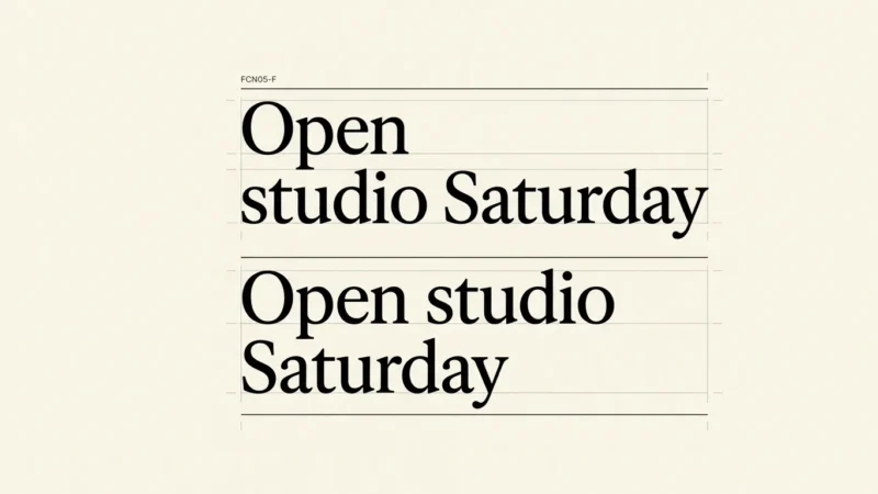
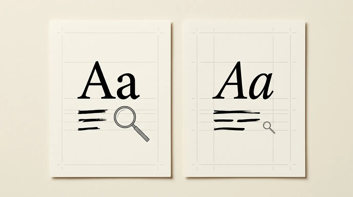
Make the comparison with a short heading and a real caption. Keep the wording and output size fixed while you switch the optical setting. Look at small internal spaces, fine strokes, punctuation and how the words fit together. Read the caption in the layout before judging the enlarged detail.
What optical size changes
The OpenType definition of the optical-size axis describes design changes for different text sizes. Those changes can include proportions, stroke weights and details. Their character depends on the typeface, script and intended use; there is no compulsory recipe that every text cut follows.
Think about a small instruction on a package and a large title on its front. The instruction must hold up when the letters occupy little space. The title gives you room to inspect fine details. Start your comparison with those two actual jobs, including the size of the printed package or delivered graphic.
Optical size is separate from the font-size field. Font size sets the scale of the text. An optical-size choice selects a design intended to work at a particular scale. Making a display cut smaller preserves its design unless the font and application also adjust its optical size.
Compare text and display cuts at the same size
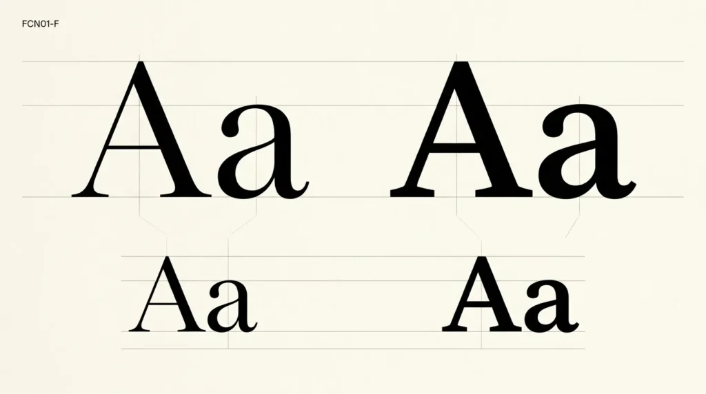
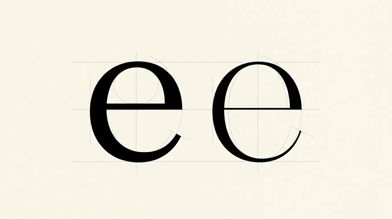
If a family contains named Text and Display cuts, place the same caption in each at the same point size. Keep the weight and tracking as similar as the family permits. Include lowercase letters, a date and punctuation, rather than judging from an oversized Aa alone.
Read the caption normally, then enlarge the view to identify what changed. A close view can help explain a difference, but the original reading size decides whether it helps. Record a concrete observation such as a clearer comma or a more open lowercase e.
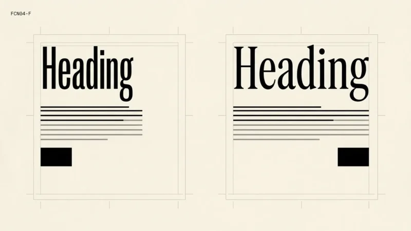
Repeat the comparison with the headline at its intended size. Compare the display cut for the heading and the text cut for the caption. Treat these names as the designer’s intended roles, then check the result. They do not establish a universal cutoff at which every font should switch.
Check whether a variable font has an optical-size axis
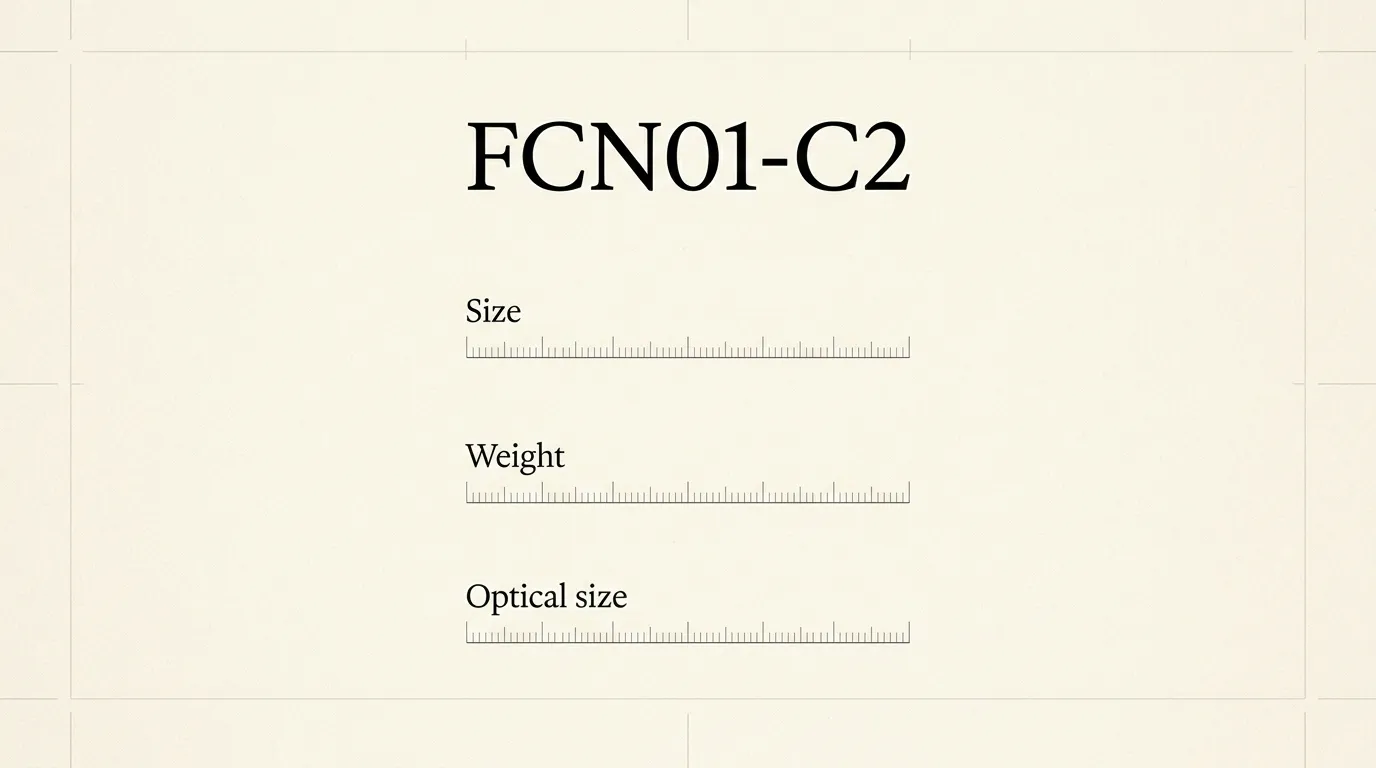
A variable font can have an opsz axis. Check the family’s documentation or the axes exposed by the application before looking for a slider. A font that varies in weight does not necessarily vary in optical size.
On the web, MDN documents font-optical-sizing: auto for fonts that support optical sizing. The value none disables that automatic adjustment. Adding the property cannot create optical variants in a font that lacks them.
For a developer handoff, name the font file and record whether automatic optical sizing is enabled. For a visual-editor handoff, save the actual optical setting or named cut alongside the font size. A screenshot of a slider without the font version does not identify the setting the next person needs.
Keep optical size separate from weight and tracking
If a caption looks fragile, compare an optical-size change with a weight change in separate copies. Keep the original next to both. Otherwise, a heavier stroke can conceal which adjustment you preferred.
Spacing also deserves its own comparison. Start from the cut’s normal spacing and look at a complete sentence. Widening every letter before checking the intended text cut makes the comparison harder to interpret. The spacing and line-height guide covers that separate adjustment.
For headings, inspect wraps after choosing the optical setting. A different design can occupy different space. Keep a two-line title in the specimen so that you notice an awkward break before approving the family for a whole set of graphics.
Check the smallest real use in the delivered output
Build a small specimen sheet around the least generous use: a caption, footnote or compact label. Add the matching headline so that you can judge the family across its roles. Keep all essential wording as editable text in the source.
Export the sheet in the format you will deliver and inspect it at the intended size. For print, use a sample at actual scale. For a website, inspect selectable text in the browser. If an image export loses detail, compare the source and export before changing the font again; the blurry-text checklist helps locate that problem.
Save a note with the chosen cut, weight, optical setting, text size and output format. A useful approval might say that the caption uses the Text cut and the large title uses Display. Avoid approving the family solely from a large preview that nobody will see in the finished piece.
Make an optical-size comparison you can repeat
Use the same source text for every version and change one design setting at a time.
- Choose the specimen
Set a real heading and the smallest caption or label the project requires.
- Identify the available designs
Check the family documentation for named text and display cuts or an opsz axis.
- Compare one control
Keep the output size, wording and other settings fixed while switching the optical design.
- Inspect the output
Read the exported or live result at its intended size, then use a close view to explain any difference.
- Save the decision
Record the cut or optical setting together with the font file, weight, size and destination.
Frequently asked questions
Font size controls the scale of the text. Optical size selects design variations intended for different reading sizes. Compare both at a fixed output size to see what the optical design changes. A font or application must support the relevant variants for the setting to have an effect.
No. A variable font may expose weight or width without an optical-size axis. Check the actual family and file. If the documentation does not list opsz or named optical cuts, choose the available design by inspecting it at the size your project needs.
Use it as a candidate and compare the actual heading. The intended role is useful guidance, but the words, viewing size and output still need checking. A family name or style label alone cannot decide whether a fine detail survives your particular layout.
Check the exported file separately. Optical sizing changes letter design; it cannot recover detail lost when a small raster image is enlarged. Keep the editable source, compare export dimensions and inspect the delivered image before treating blur as a reason to replace the font.