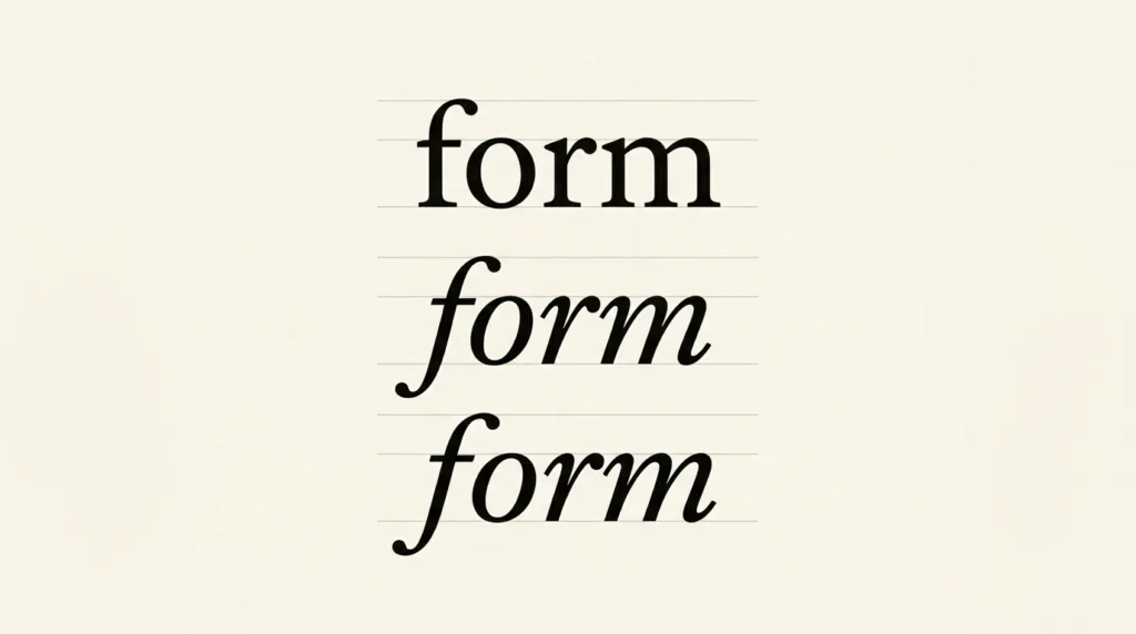
When comparing italic vs oblique fonts, look at the letter design as well as the slope. An italic may use forms that differ from the upright design. An oblique usually retains the upright forms with a slant. Choose the actual style your font provides, then read it in the sentence where you need emphasis.
Affiliate Disclosure: If you buy through links on our site, we may earn a small affiliate commission to help support the blog – at no extra cost to you. It never influences our product selection process. Thank you!
- Italic vs. Oblique Fonts: Choosing Emphasis That Stays Readable
- Look for changed letterforms, not only an angle
- Find out which style is actually available
- Use italics for a phrase you want readers to notice
- Review captions and quotations as complete passages
- Compare another emphasis method when italics feel cramped
- Record a style rule with real examples
- Check an italic style before using it throughout a design
- Frequently asked questions
Start with a short phrase inside ordinary upright text. That lets you judge the change in context. A large tilted word gives you little basis for judging a small caption or a full quotation. Compare each use in its own layout.
Look for changed letterforms, not only an angle
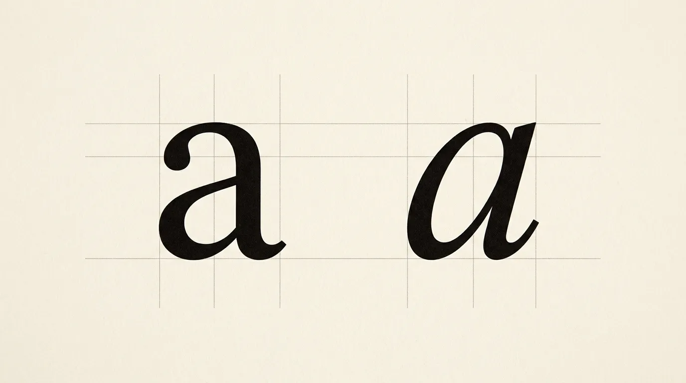
MDN’s font-style reference distinguishes italic and oblique faces. Italics are generally cursive in design, while obliques are usually sloped versions of the regular face. Individual families differ, so inspect a few actual letters before assuming what a menu label will produce.
Type a, f and a short word in the upright and italic styles. Examine whether the shapes change, where the letters begin and end, and how they sit together. Then return to normal viewing size. You are selecting a usable text style, so the passage must still read comfortably outside a close-up.
A carefully designed oblique can be the intended companion to an upright family. Treat it as a valid design choice. Check for an unexpected substitute when the source file and delivered page use different faces.
Find out which style is actually available
Check the family listing and the font files used by the project. A regular font file alone does not prove that an italic companion has been supplied. In a shared design, note the style’s full name so that someone else can choose the same one.
Browsers can simulate a slant when an appropriate style is missing. MDN documents font synthesis and the controls for disabling it. Disabling synthesis does not supply a missing italic face; the intended style still needs to be available.
For a website problem, ask the developer to check the rendered font and the style declaration. For an exported graphic, compare the editable text with the final file. Avoid changing to another family until you know whether the intended style was loaded or selected.
Use italics for a phrase you want readers to notice
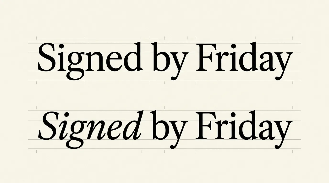
Write one sentence containing the proposed emphasis. Read it once with the phrase upright and once in italic. Does the emphasis fall on the intended words? If every other phrase is marked, decide which distinction the reader actually needs.
For example, compare the sentence “Return the signed copy by Friday” with emphasis on “signed” and then on “Friday.” The first version directs attention to the required document; the second directs attention to the deadline. Choose the wording and emphasis together.
On websites, the HTML em element marks stress emphasis. Purely visual italic styling is a separate choice. Match the markup to the meaning instead of turning every slanted label into an emphasis element.
Review captions and quotations as complete passages
A short emphasized phrase and a multi-line quotation create different reading tasks. Set the whole quotation, including attribution and punctuation, before deciding that it should be italic throughout. Read across its line endings and compare an upright version.
If the quotation is already set apart by its position, spacing or border, keep those treatments fixed during the comparison. Otherwise, a change to the surrounding layout can make the italic appear responsible for an improvement that came from extra space.
For a caption, include a realistic long example. Check whether its small letters, numerals and punctuation remain clear in the export. The character-legibility guide gives you more useful specimens than a single decorative word.
Compare another emphasis method when italics feel cramped
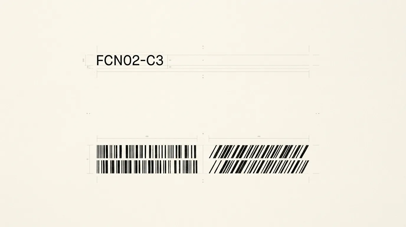
Make separate copies using the available italic and a modest weight change. Keep the wording and size constant. Read both inside the surrounding paragraph, paying attention to whether the marked words interrupt the sentence more than intended.
Bold can suit an action or a required field, while a title convention may call for italic. Follow the document’s editorial style when one exists. For interface labels, clearer wording or extra space can also make a distinction easier to understand.
Inspect the result alongside nearby headings. A phrase that competes with the heading can distort the hierarchy. Use the font-weight comparison and the hierarchy checklist to decide which role deserves the stronger treatment.
Record a style rule with real examples
Save a sentence showing emphasis, a long caption and a quotation if the publication uses one. Include the exact family and style name. This gives the next editor examples of both the intended appearance and the amount of emphasis.
State any exceptions explicitly. A scientific name, a work title and a stressed word may follow different editorial rules even when they appear similarly slanted. On a website, have the content editor and developer agree on meaning as well as appearance.
Reopen the delivered page or export before approving the rule. Check the smallest use, the longest passage and any line with awkward punctuation. Save the output with the specimen so future edits can be compared with the same reference.
Check an italic style before using it throughout a design
Use a short emphasis example and a longer passage to review the same style in context.
- Confirm the face
Check the supplied font family for a real italic or designed oblique and note its full style name.
- Build a useful sample
Set a sentence with one emphasized phrase and a realistic caption or quotation.
- Compare in context
Hold size and layout fixed while comparing the upright and slanted versions.
- Inspect delivery
Check the actual rendered font on the website or compare the source with the exported file.
- Save the convention
Record which content roles use the style and keep examples with the final settings.
Frequently asked questions
A designed oblique can be the intended slanted companion to a family. It usually keeps the upright letterforms, while an italic may use different forms. Inspect the actual face in your passage. The label alone does not tell you whether it suits the intended use.
The application may be using a sloped face or simulating one because a companion italic is unavailable. Check the family, selected style and supplied files. On a website, inspect the rendered face and font-style declarations before assuming that the intended italic has loaded.
Compare the complete quotation in its layout and follow the publication style. Position, spacing and attribution may already distinguish it from surrounding text. Read the longest realistic version at normal size before applying the same treatment to every quotation in the document.
Appearance and meaning need separate decisions. HTML em marks stress emphasis; CSS font-style controls visual styling. Other content, such as a work title, can require different markup. Choose the structure that fits the content, then style it consistently with the rest of the page.