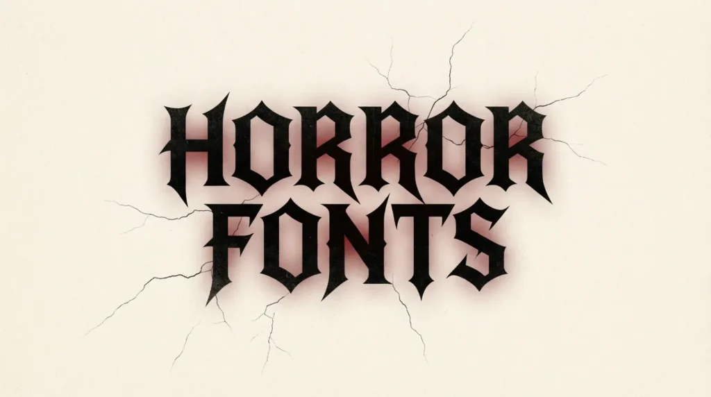
If you are looking for horror fonts, the first thing to know is that scary lettering only works while people can still read it. A title that melts, drips and cracks looks great in the editor and turns into noise on a phone screen, a shop shelf or a game store tile. I would take a clean gothic headline with a red glow over a pile of effects on an unreadable word. The sections below cover what makes a font creepy and scary, gothic and blackletter picks from the FontCue catalog, retro B-movie lettering, pixel and fantasy fonts for games, and how to add color and texture without losing the word. The catalog has a set of true horror display fonts, such as Creepster, Nosifer and Rubik Wet Paint, so the dripping section starts with real fonts and keeps texture as an extra. Horror runs all year, and Halloween is just one use among several, next to film posters, book covers, podcasts and merch. Scary also means different things: cold gothic dread, campy drive-in fun and pixel-art survival horror each want a different font. Every font named here is a real catalog listing. Where I describe a style that the font’s page does not state, I say so and ask you to check the specimen.
Affiliate Disclosure: If you buy through links on our site, we may earn a small affiliate commission to help support the blog – at no extra cost to you. It never influences our product selection process. Thank you!
- Horror and Spooky Fonts for Posters, Games and Halloween Designs
- What makes a font feel scary
- Gothic and blackletter horror styles
- Dripping, scratched and distressed styles
- Retro B-movie and pulp horror lettering
- Spooky fonts for games and thumbnails
- Color, glow and texture without losing legibility
- Licensing for posters, games and merch
- FAQ
- Choosing horror fonts that scare and still read
Get the Free Display Fonts — free download.
Download FontsWhat makes a font feel scary
Fear in type comes from a few visual signals. Sharp or broken stroke endings read as danger. Extreme contrast between hairline and heavy strokes feels formal and ominous, the way old church lettering does. Uneven edges and missing pieces suggest damage, age or decay. Tall, narrow proportions feel looming. Ornament and flourishes suggest the occult or the antique. Pick one or two signals per design. Stack all of them and nobody can read the title.
Legibility is the limit. Horror fonts are display fonts, meant for a title of one to four words at a large size. Keep the letter spacing a little open when the shapes are complicated, so the strokes do not merge into a dark clump.
The classic safe pairing is a scary title with a plain companion. Set the headline in the dramatic face, then use a neutral sans-serif or serif for dates, credits and descriptions. If both lines are decorated, neither one stands out.

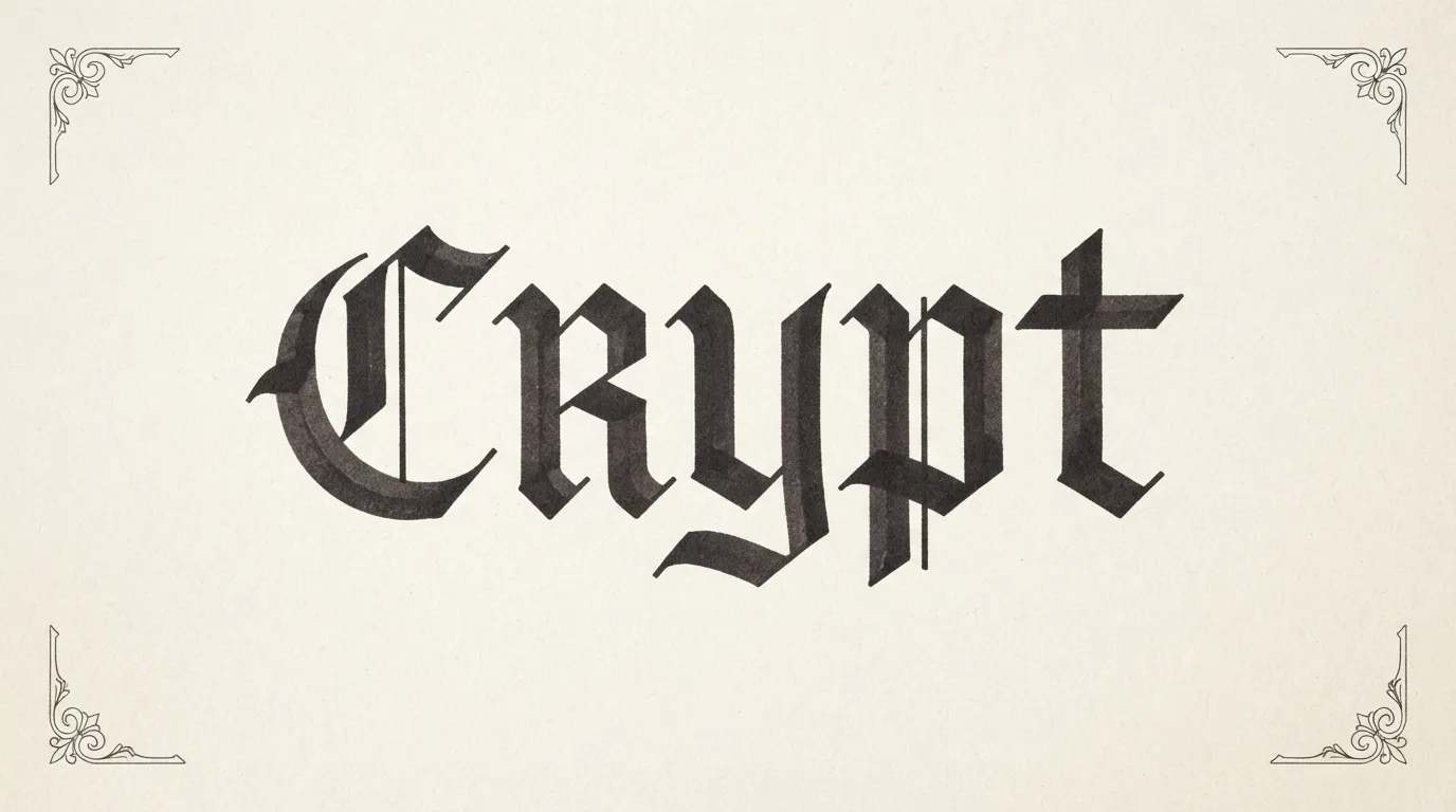
Gothic and blackletter horror styles
Blackletter and gothic lettering is the quickest route to a dark mood, because the sharp, angular, high-contrast forms already feel medieval and ominous. It is also easy to overdo. Blackletter in all capitals is hard to read, so use mixed case and a short line. Our guide to old English, gothic and vintage fonts covers where these styles fit.
Blocus is a good first pick. Its catalog page describes it as a light typeface somewhere between a Fraktur and a Didone, with broken curves, strong thick-thin contrast and imposing verticals, giving headlines a gothic but modern edge. It has 1 style, and it suits a cold, stylish kind of horror such as a gothic novel cover.
UnifrakturCook and Pirata One are both single-style display fonts on the catalog. Their pages carry only the standard listing text, so the following comes from general knowledge, not the page: both draw on blackletter forms, and Pirata One is the more compact of the two. Check each specimen before you choose.
Bury Caps takes a different route. The catalog says it is inspired by the display capitals of the 12th-century Bury Bible, with stately lowercase letters and ornate capitals full of whimsical flourishes. It suits an old-world creepy look, such as a haunted-library poster. Ouroboros is an ornamental display typeface influenced by Art Nouveau, with a set of alchemical symbols, and its page says it suits mystical themes. It fits occult and potion-label designs.
Metal Mania (designer Open Window) and New Rocker (Impallari Type) are single-style display fonts. Their names point to heavy metal and rock, which suits band posters and merch. Check the specimens for the exact shapes.
Dripping, scratched and distressed styles
Dripping, scratched and distressed lettering is what most people picture when they type “horror font”. The catalog now has several fonts here. Each is a single-style Display font under the SIL Open Font License 1.1 with commercial use marked as allowed, but the pages carry only the standard listing text, so check each specimen.
Nosifer and Eater, both by Typomondo, and Creepster by Sideshow are the first three to test for blood-style and creepy-movie titles. From general knowledge, not the pages, all three have rough, dripping shapes. Butcherman (Typomondo) is named for a gory butcher-shop mood. Rubik Wet Paint, by NaN and Luke Prowse, is named for a wet, dripping paint look.
The damage in these fonts is part of the letter shapes, so you cannot turn it down. For a milder or custom effect, start with a clean, heavy face and add the damage as a separate layer: a texture or scratch overlay set to erase or blend into the letters. The letterforms underneath stay intact, so the word survives.
Control the amount of damage. Light wear on the edges reads as aged and spooky, while heavy gaps break thin letters into pieces. If you squint at the title and still recognise the word, the texture is fine.
If you add drips yourself, put them under only a few letters and leave the rest clean. Drips on every letter fill the gaps and slow reading. One drip on the last letter says the same thing with less clutter.

Retro B-movie and pulp horror lettering
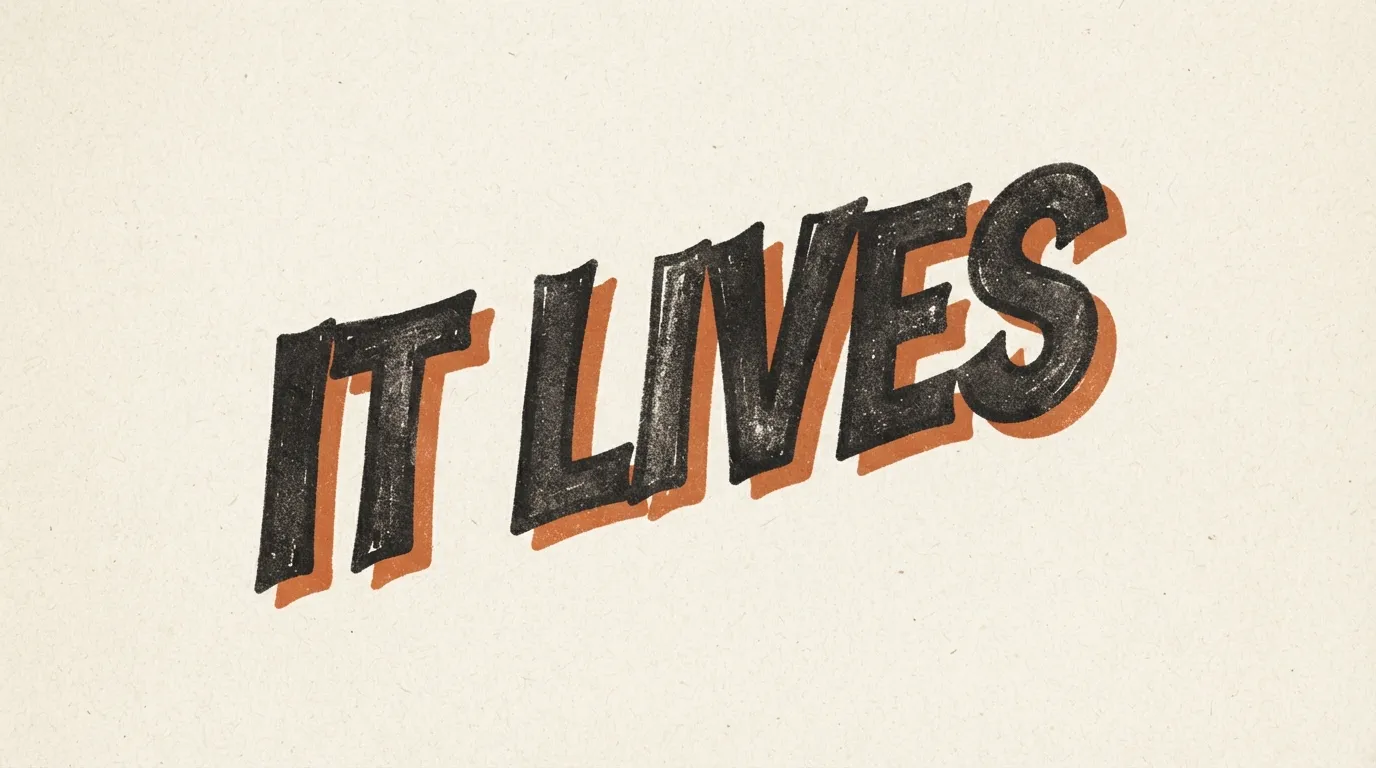
Not all horror is dark and gothic. Drive-in and pulp lettering is loud and a little silly, with big capitals, bold outlines and bright colors. It suits Halloween parties, horror-comedy nights and campy podcast art, where the goal is a shiver and a smile at once.
Bangers is a single-style display font credited on its page to Vernon Adams. The page has no written description, so the loud comic-lettering feel is my own reading of it. Check the specimen to see if it matches what you need. Set it large with a thick dark outline and a hard offset shadow. For a more sober look, Bebas Neue is described by the catalog as a condensed, all-caps display sans-serif with a strong, modern look, a favorite for posters and titles. Add a red outline for a film-title feel.
Grotesque Bourgeoisie is worth trying for Victorian pulp horror. The catalog says it revives an 1880s typeface used for business cards and titles and carries the fussy, ornamental charm of Victorian print. That fits a penny-dreadful style of poster, with a ghost-story or a mystery tone more than a gore one.
For haunted-house and campy looks, try Jolly Lodger (Font Diner), Henny Penny (Brownfox), Frijole (Sideshow) and Griffy (Neapolitan). Each is a single-style Display font. Their pages say little about the shapes, so compare the specimens.
Layout is what finishes the look. Pulp posters use a tilted title, two or three colors and strong contrast. If you want more headline ideas, our guide to poster fonts covers layouts that stop the scroll.
Spooky fonts for games and thumbnails
Horror game titles and video thumbnails are small, sit on a busy picture and must be read in a second. Pixel and fantasy titling fonts are the natural choices.
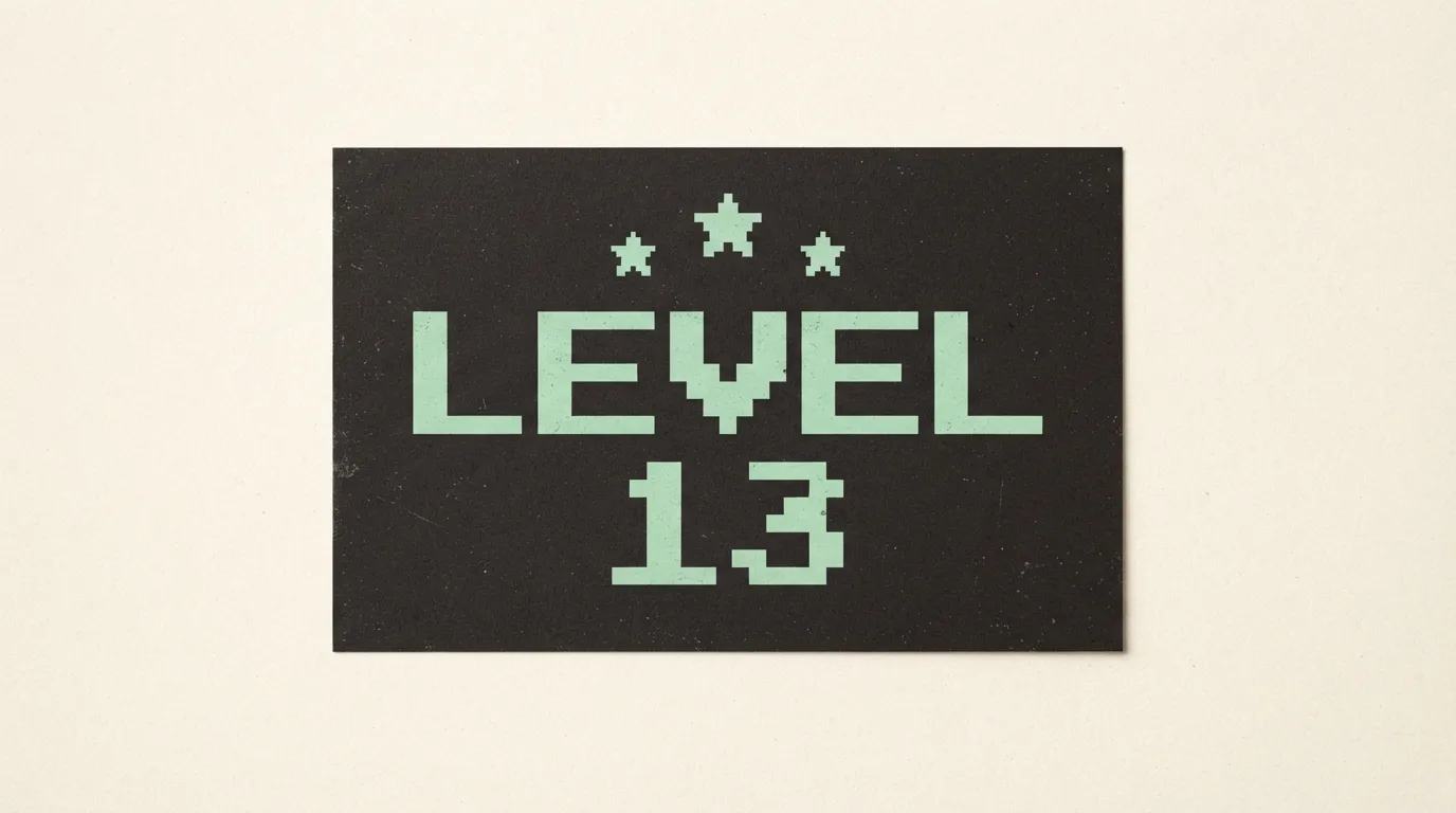
Monocraft is a monospaced pixel font modelled on the lettering in Minecraft, extended into a full programming font, and the catalog says it suits game-themed posters, streams and code screenshots. It has 6 styles. Dogica is an 8×8 pixel monospace font with more than 200 characters, made for the GB Studio game maker, with 4 styles. The regular version is smooth, while the Pixel version is tuned to render perfectly on a pixel grid. Departure Mono is a pixel-style monospace inspired by retro technical interfaces, with an 8-bit terminal feel, and has 1 style. For a retro survival-horror look, try red or pale green on black.
Montchauve is a modular titling fantasy font built from repeated geometric parts, and its page says the fairy-tale angular letters fit posters, game titles and fantasy book covers. It has 1 style. Its angular build suits a dark-fantasy game logo. Mystery Quest, by Sideshow, is a single-style Display font whose name points to adventure and puzzle games. Check its specimen before you build a logo on it.
For thumbnails, keep the text to a few words and test it at phone size. Our pixel and retro gaming fonts guide explains how to size pixel fonts so their edges stay sharp.
Color, glow and texture without losing legibility
Color does most of the emotional work in a horror design, and it is also the easiest way to wreck readability. The common palette is a near-black background with a blood red, bone white or sickly green title. Contrast comes first. Red on black has a lower brightness difference than people expect, so use a brighter red, add a lighter edge, or set the title in off-white and use red as the accent.
Glow suits dark designs as long as the letter itself stays solid and the glow sits outside it. A soft colored halo around a light title adds mood and lifts the word off a dark picture. A glow that bleeds into the letters themselves blurs the edges and weakens the shape. Our guide to outline, 3D and shadow font effects shows how to build these effects step by step.
Texture works best on the background. Film grain, a paper stain or fog behind the title gives atmosphere and leaves the word intact.
Last, view the design in greyscale. If the title disappears without color, the design relies on hue instead of contrast.

Licensing for posters, games and merch
Posters, games and t-shirts are commercial uses once you sell them, so check the licence first. Every font linked in this article is listed on FontCue with SIL Open Font License 1.1 terms and commercial use marked as allowed. Read the licence file for the exact terms. This is not legal advice.
The licence covers the font file, not the rest of your design. Stock photos, textures, clip art and sound have their own rules, so check the source of every overlay. If you ship a font inside a game or an app, read the licence terms on embedding before release.
Do not describe your title as the lettering of a particular film or franchise. A similar style is fine. A claim about a studio’s lettering is not. Our guide to free fonts and commercial use lists what to check, and the article on holiday and seasonal fonts covers the Halloween side of the calendar.
FAQ
Scary fonts break the rules of tidy type: sharp or broken strokes, uneven edges, extreme contrast between thick and thin, or letters that look cut, scratched or melted. The effect works when the shapes are still recognisable. If a viewer has to decode the word, the fear turns into annoyance and they scroll past.
No. Horror and gothic display fonts are built for a few words at large size. Set the title in the scary font and everything else in a plain, open sans-serif or serif. The contrast between the two makes the title look more dramatic and keeps the rest of the page readable.
No. Horror lettering is used all year for film and event posters, game titles, book covers, podcast art, metal and punk merch, and escape rooms. Halloween is one busy season for it, but the styles suit any project where you want tension, dread or dark humour.
Check each font page before you commit. The fonts linked here are listed on FontCue with SIL Open Font License 1.1 terms and commercial use marked as allowed, but the licence file holds the exact terms, and it covers only the font. Artwork, logos and images you add have their own rules.
Choosing horror fonts that scare and still read
Decide the kind of fear first. Cold, elegant dread suits a gothic face like Blocus on a short line. Old-world occult suits Bury Caps or Ouroboros. Blood and gore want a built-in drip such as Nosifer or Rubik Wet Paint. Metal wants Metal Mania. Campy fun wants Jolly Lodger or a loud comic face with an outline. A game wants a pixel font like Monocraft or Dogica, or a fantasy titling face like Montchauve. Use one scary font per design, set plain type around it, add a texture layer only when the font needs a milder look, and shrink the result to the size people will see. If the word still reads, your horror fonts are working. Download two or three from the display category, set your own title in each, and keep the one that still reads when the design is the size of your thumb. Then read the licence on whichever font you pick before you publish.