Poster fonts have one job before any other: make a stranger read your headline in about two seconds, usually while they are walking past or flicking through a feed. I have a soft spot for headline type that looks slightly too big for its page, because a poster is one of the few places where that is correct. The trouble is that “poster font” gets treated as one category when it is really several different headline styles, each suited to a different kind of event. A gig flyer and a gallery opening should not share a headline font, and a heavy grotesque that sells a warehouse party will flatten a wine tasting. Most of the lists I see online stop at a row of names. That leaves out the part that matters, which is how to judge a headline once it is on the page and how to keep it from fighting the rest of the layout. This guide sorts display fonts for posters into styles that work, explains what makes a headline readable from a distance, and ends with pairing recipes you can copy. Every font named here links to its page in the FontCue catalog, where you can check the license details before you use it.
Affiliate Disclosure: If you buy through links on our site, we may earn a small affiliate commission to help support the blog – at no extra cost to you. It never influences our product selection process. Thank you!
- Poster Fonts: Headline Styles That Get Noticed (and How to Pair Them)
- What makes a poster headline readable from a distance
- Bold condensed grotesques
- High-contrast serifs
- Ornamental and Art Nouveau headlines
- Pixel, brush and gothic accents
- One loud font, one quiet font
- Pairing recipes that work
- A quick test before you print
- Choosing your poster headline
Get the Free Display Fonts — free download.
Download FontsWhat makes a poster headline readable from a distance
Readability at a distance depends mostly on letter height, stroke weight and the gap between lines. A tall, heavy letter holds its shape when it shrinks in the eye, while a thin or wide one dissolves. That is why the classic poster headline is narrow, tall and bold: it gets more letter height out of the same horizontal space.
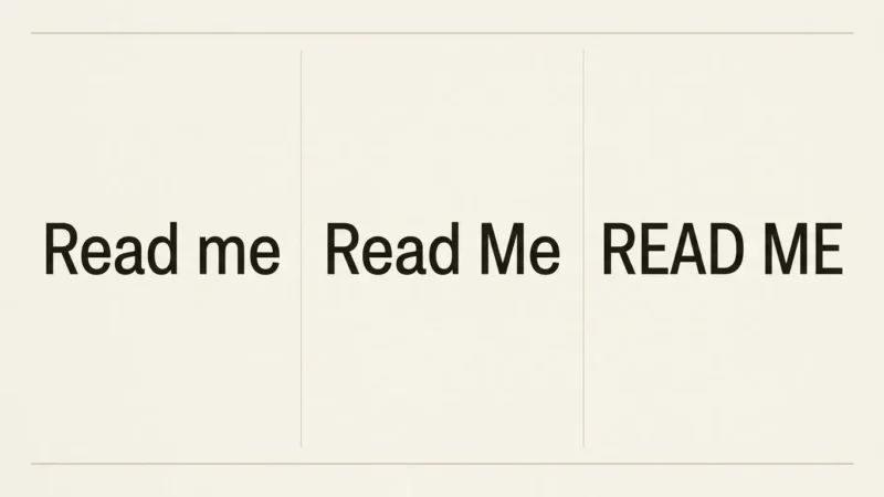
Spacing does the rest. Headlines set in capitals usually need a touch more letter spacing than lowercase, because capitals have no ascenders and descenders to help the eye tell words apart. Lines stacked tightly look confident, but they need to stay clear of each other, so check that no ascender crashes into the line below it.
Contrast matters as much as the font. Dark type on a light field or the reverse is always safer than mid-tone on mid-tone, and a busy photo behind the headline usually needs a solid block, a tint or a shadow to keep the letters legible.
If you need exact point sizes for print formats, the font size guide for posters and t-shirts covers that ground. This article is about choosing the headline style itself. For the general logic of pairing, see font pairing and hierarchy fundamentals. This article stays with the loud end of the page.

Bold condensed grotesques
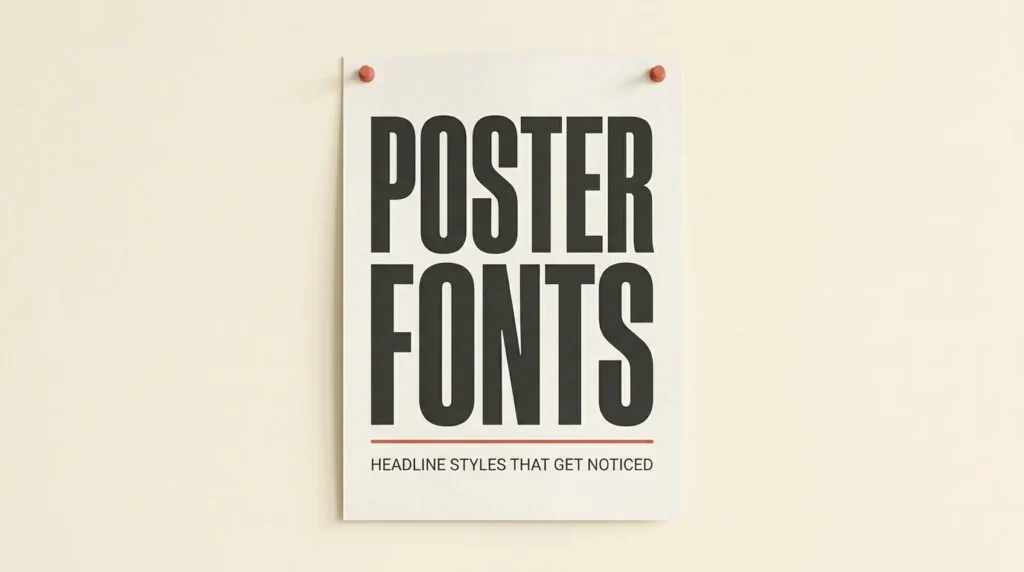
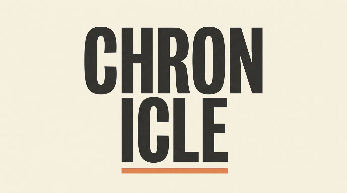
If you only learn one poster recipe, learn this one. A heavy, narrow sans serif lets you run a long headline across a small flyer at a large size, and it reads as direct without trying hard.
Anton and Bebas Neue are the catalog’s dependable condensed display choices, and Oswald gives you a slightly more flexible alternative when you want the same narrow proportions with a less shouty feel. Staatliches has a similar compact, capital-driven look. If you want width and weight instead of narrowness, Archivo Black and Passion One are heavy and punchy, and Unbounded is a wide, rounded-feeling option that suits tech events and launches.
For something less default, try Sturkopf Grotesk or Fabrik, both narrow grotesques with more personality than the usual suspects, or Sporting Grotesque, which goes wide rather than tall and works well for sports and festival lineups.
Best for: concerts, sales, sports, protests, startup events and anything where the message is “read this now”.
High-contrast serifs
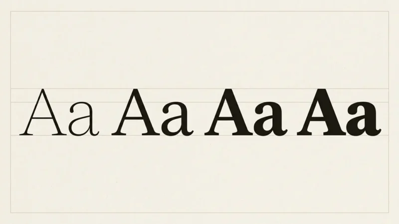
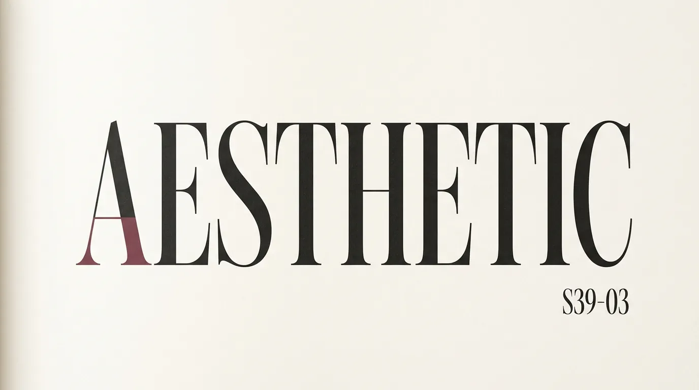
When the event is about taste, a condensed grotesque can feel too blunt. A high-contrast serif, the kind with thick vertical strokes and hairline thin ones, signals fashion, editorial or fine dining instead.
DM Serif Display and Abril Fatface are the heavy, display-focused choices here, built for large sizes. Playfair Display sits in the same family of look with a slightly more restrained feel, and Prata brings a lighter, more classical feel. Cinzel is worth a look for capital-only headlines, since its capitals have a classical, carved-in-stone look that suits anything ceremonial.
The catch is the hairlines. At small sizes or on cheap paper they can thin out, so keep these fonts big and avoid setting them on a textured or noisy photograph. A plain background and plenty of white space let the contrast show.
Best for: gallery openings, fashion events, restaurant menus, theater and film posters with a literary tone.
Ornamental and Art Nouveau headlines
This is the style that makes people stop because it looks unlike anything else in the feed. Ornamental display faces carry swashes, curled terminals and quirky proportions, and they turn a headline into an illustration.
In the catalog, Bury Caps is a tall, narrow capitals face with curled flourishes, and Blocus has swashy capitals with a flowing, old-print feel. Celtica takes its shapes from Celtic-style lettering, which fits folk nights and heritage events. Ouroboros goes the other way, with heavy, rounded, almost 1970s letterforms, and Grotesque Bourgeoisie adds a slanted, decorative inline treatment. Montchauve is a light, geometric line face that only works very large.
These fonts carry the design, so keep everything else calm. Use them for a headline of one to four words, give them room, and set dates and addresses in something plain.
Best for: theater, cabaret, craft fairs, tattoo and barbershop flyers, themed parties, album art.

Pixel, brush and gothic accents
Some styles work better as a small hit than as the whole headline.
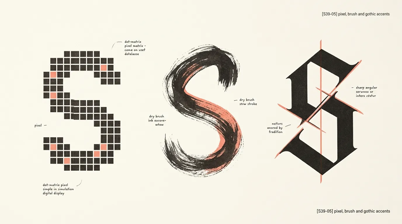
Pixel and dot-matrix type reads instantly as gaming, arcade and early computing. Dotrice is a dot-matrix face in the catalog, and Terminal Grotesque has a screen-native feel. Like other display styles, they only hold up at large sizes.
Brush and handwritten type adds energy and a human touch. Kaushan Script is a good example: use it for one word, set it over or beside a plain headline, and never for a whole line of information.
Gothic and blackletter headlines suit metal gigs, tattoo shops and old-world brewery posters. The catalog has no true blackletter face yet, so for that mood read the guide to Old English, Gothic and vintage fonts, which covers where those styles earn their place. Blocky, chunky lettering in a similar spirit is covered in the graffiti, block and brush fonts guide.
One loud font, one quiet font
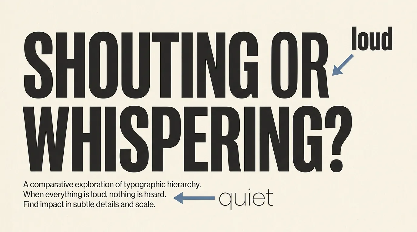
On a poster the headline is loud and everything else is quiet. Choose one display font for the headline and one plain font for the rest, and do not let them compete.
The two fonts should differ in an obvious way, such as a heavy condensed headline with a light, wide sans serif beneath it. Two similar-but-not-identical fonts look like a mistake. Two clearly different ones look designed.
Good quiet fonts are plain and open. Inter, DM Sans and Work Sans are dependable sans serifs for dates, venues and ticket details, and Lora works when you want a calm serif.
Size carries the rest. A useful rule of thumb is that the headline should be several times larger than the supporting lines, and the date or call to action comes second. If you catch yourself making three things loud, choose the one that matters and turn the others down.
Pairing recipes that work
Treat these as starting points. Each has one loud font and one quiet font.
- Club night or sale: Anton headline with Inter details. Heavy, narrow and direct.
- Gallery opening: DM Serif Display headline with DM Sans details. Editorial and calm.
- Festival lineup: Sporting Grotesque headline with Work Sans details. Wide and energetic.
- Craft fair or folk night: Celtica headline with Lora details. Warm and a bit old-world.
- Arcade or game jam: Dotrice headline with Inter details. Clean and screen-native.
- Fashion or restaurant: Abril Fatface headline with DM Sans details. High contrast, plenty of white space.
For flyers, add a third element only as a tiny accent. A single word in Kaushan Script on top of a condensed headline can add personality without breaking the hierarchy. If you want the wider theory behind any of these pairs, the font pairing fundamentals guide explains contrast in more detail. For social graphics and wide formats, the banner fonts guide covers sizing and cropping for feeds.

A quick test before you print
Most font lists skip this step. Pick the headline on a screen, then look at it the way a passerby will.
Shrink the design to thumbnail size, or pin a printout on a wall and step back. Squint. The headline should still read as words, the date should still be findable, and the eye should land on one place first. If two things compete, shrink the lesser one.
Then check the traps. Do letters like r and n merge when you half-close your eyes? Is there enough contrast against the background? Is there a clear gap between the headline and the details?
Last, check the license. Every font in the FontCue catalog lists its own license on its page, so read it before using a font on anything you plan to sell or promote. For a wider primer, read the free fonts commercial use license guide.

Choosing your poster headline
The best poster fonts match the mood of the event and stay out of the way of the message. Name the feeling first, whether that is direct, elegant, strange or nostalgic, then pick the headline style that carries it. Keep one quiet font for the details.
If you are unsure, start with a condensed grotesque, because it is hard to get wrong, and move to a serif or an ornamental face when the project earns it. Run the squint test, check the license on the font’s page, and print one proof before a full run. Good poster fonts make the decision easy for the viewer: one thing to read first, one place to look next.
For more options, browse the free display fonts in the FontCue catalog. It is a quick way to try several headline styles side by side with the same sample text before you settle on the one that stops people in the street.
—
There is no single winner, but bold condensed sans serifs such as Anton, Bebas Neue and Oswald are the safest starting point because they fit a lot of letter height into a narrow space and stay readable from far away. Switch to a high-contrast serif or an ornamental face only when the event’s mood calls for it.
Two is the practical limit for most posters: one loud display font for the headline and one quiet, plain font for details like dates and addresses. A third font is only worth adding as a tiny accent, such as a script word or a pixel label, and it should appear once, not everywhere.
No. Ornamental, pixel and script fonts lose legibility quickly in small sizes and long lines. Keep them to the headline or a single short phrase, and set dates, prices and addresses in a plain sans serif or a simple serif so nobody has to decode them.
Pin the design up or view it at thumbnail size, step back several paces and squint. If the headline still reads as a clear block of words and the date is still findable, it works. If letters blur together, increase the size, add space between lines or switch to a sturdier font.