Choosing book cover fonts starts with one question: what does the reader see when the cover is the size of a postage stamp? Online shops show your book as a small thumbnail in a grid, and in that grid a delicate title or a crowded subtitle disappears. I would rather see a plain, strong title that signals the genre in a second than a clever typeface that needs a full-size screen. A typeface that looks lovely on a big monitor can turn pale in the shop grid, so choose for the thumbnail first and for the full-size cover second. This guide covers the type conventions for thrillers, romance, fantasy and non-fiction, with free fonts from the FontCue catalog for each. It then sets out how to size the title, subtitle and author name, how to pair two fonts, and what to check on the licence before you export a print or ebook cover. Every font named here is a real listing in the catalog, and what I say about each one comes from its catalog page. Genre conventions are described in general terms, and I do not imitate any published cover. It is written for self-published authors and designers building a cover from scratch.
Affiliate Disclosure: If you buy through links on our site, we may earn a small affiliate commission to help support the blog – at no extra cost to you. It never influences our product selection process. Thank you!
- Book Cover Fonts by Genre: Title, Subtitle and Author Name Pairings
- What a book cover font has to do
- Thriller and mystery covers
- Romance and women’s fiction covers
- Fantasy and sci-fi covers
- Non-fiction and business covers
- Title, subtitle and author name hierarchy
- Pairing two fonts on a cover
- Print and ebook licensing checks
- Picking book cover fonts that fit your genre
Get the Free Serif Fonts — free download.
Download FontsWhat a book cover font has to do
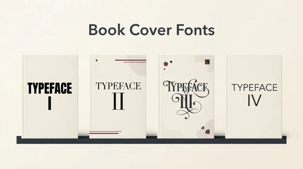
A cover font has two jobs. It has to be readable at thumbnail size, and it has to tell a browsing reader which shelf the book belongs on before they read a word. Readers treat type as a genre signal. Heavy and blunt reads as tension, curling and delicate reads as romance, ornamental capitals read as fantasy, and plain and confident reads as a book that wants to teach you something.
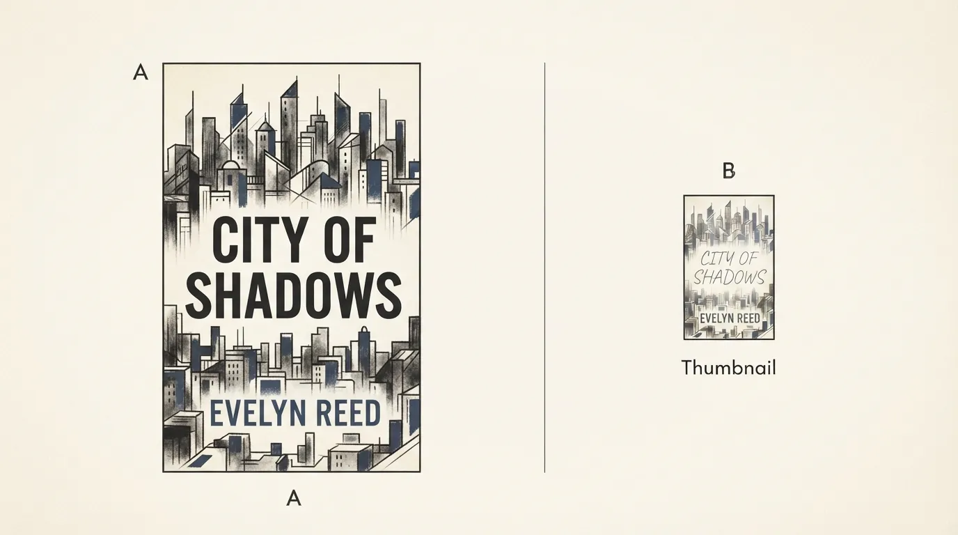
The thumbnail test comes first. Shrink the cover to a small square and look at it for one second. Thin hairlines, tight counters and long subtitles fail it, because fine detail fills in as the image shrinks. A mid-grey title on a mid-tone photo fails it too.
Pick the typeface for the genre, then pick the weight for the thumbnail. A romance title can be set in a script and still pass, as long as the stroke is thick enough and the title is short. A thriller title in a heavy grotesque passes almost by default.
Stroke weight, contrast, width, ornament and case carry most of the signal. Our guide to font pairing and hierarchy covers the basics of how those traits set mood.
Thriller and mystery covers
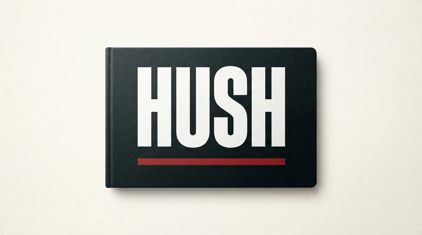
Thriller and mystery covers usually lean on weight and restraint: a short title in large capitals, tight spacing, often a single strong color against a dark or desaturated image. The font should feel blunt, not decorative.
Sturkopf Grotesk is a good starting point. Its catalog page, which lists 1 style by Uwe Borchert, describes the blunt, poster-ready look of early 20th-century German grotesques. Fabrik is an industrial grotesque in the style of the 1920s, with 3 styles. Bebas Neue is a condensed, all-caps display sans-serif with 1 style, and its narrow capitals fit long titles across a cover.
For a colder, more gothic edge, Blocus sits between a Fraktur and a Didone, with broken curves and strong thick-thin contrast according to its page. Its page calls it light, so test it at thumbnail size and keep titles short.
Keep the layout simple: one font, one color for the title, and a second color or a quieter font for the author name. A tagline, if you add one, goes small and out of the title’s way. Our poster fonts guide shows more heavy headline styles that carry across to cover work.
Romance and women’s fiction covers
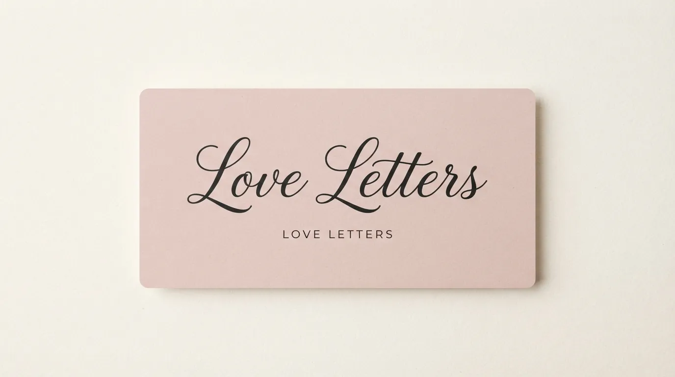
Romance covers tend to be warmer and lighter: script titles, high-contrast serifs, soft color and generous space. The risk is legibility. A pretty script with thin strokes can look elegant at full size and turn into a pale scribble in a thumbnail.
Playfair Display is a transitional serif with high contrast and 4 styles, which its page describes as well suited for headlines and display text. Set a short title in it at a large size and run the thumbnail test.
For script titles, Parisienne has generous loops and a light calligraphic stroke, with 1 style. Sacramento is a fine-lined monoline script with tall ascenders and sweeping connections, also 1 style. Both are thin, so give them room and keep the title short. Princess Sofia is a fine, looping script, and its page says it is best used at larger sizes. If your title is long, switch to the serif.
A script title with a plain serif or sans-serif in capitals for the author name keeps the name legible while the title carries the mood. Our calligraphy and cursive reference explains how script letters connect.
Fantasy and sci-fi covers
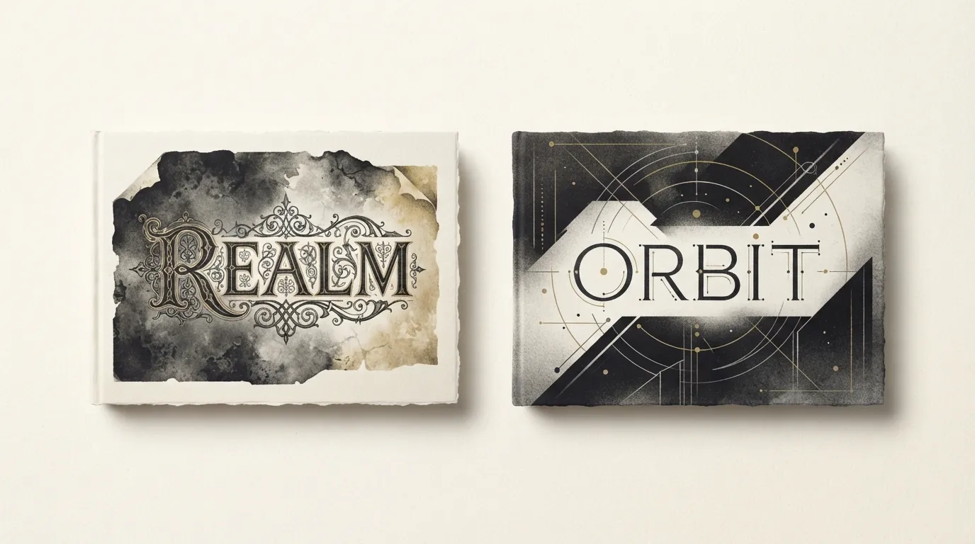
Fantasy covers invite ornament. Titles are often large, centered and decorative, with letterforms that suggest manuscripts, runes or old inscriptions. Sci-fi pulls the other way, toward geometric, technical or pixel-influenced shapes.
Montchauve is a modular titling font built from repeated geometric parts, and its page says the angular letters fit fantasy book covers. It has 1 style. Celtica is based on uncial, half-uncial and Carolingian scripts and the page describes the look of a medieval manuscript. It has 4 styles. Bury Caps takes its design from the display capitals of the 12th-century Bury Bible, and its capitals are ornate with flourishes. Use it for a short title, not a long line. Ouroboros is an ornamental display face influenced by Art Nouveau, and its page lists mystical themes among its uses.
For sci-fi, Terminal Grotesque mixes a bitmap-terminal look with the proportions of a classic grotesque. It has 1 style. For more retro-future options, see our pixel and retro gaming fonts guide.
Ornate fonts are the hardest to read at thumbnail size, so keep the title short and the author name plain.
Non-fiction and business covers
Non-fiction covers sell clarity. The title should state the subject quickly, the subtitle should promise a result, and the font should look trustworthy rather than expressive.
Glacial Indifference is a clean geometric sans-serif inspired by Bauhaus shapes, with round, even letters and open counters according to its page. It has 2 styles. Orkney is a geometric typeface designed for clarity and legibility, with 6 styles and a friendly, open feel. Geist is a Swiss-inspired sans-serif with 6 styles whose page says it stays crisp at small sizes, which suits subtitle lines.
For a more literary or reflective title, Le Murmure is a quiet serif with soft, slightly irregular shapes that its page says work best in large sizes for titles, covers and editorial layouts. It has 1 style. For something more commanding, Bebas Neue suits short, direct business titles.
Non-fiction subtitles run longer. Keep yours to one or two lines in a quiet companion font, with room around it.

Title, subtitle and author name hierarchy
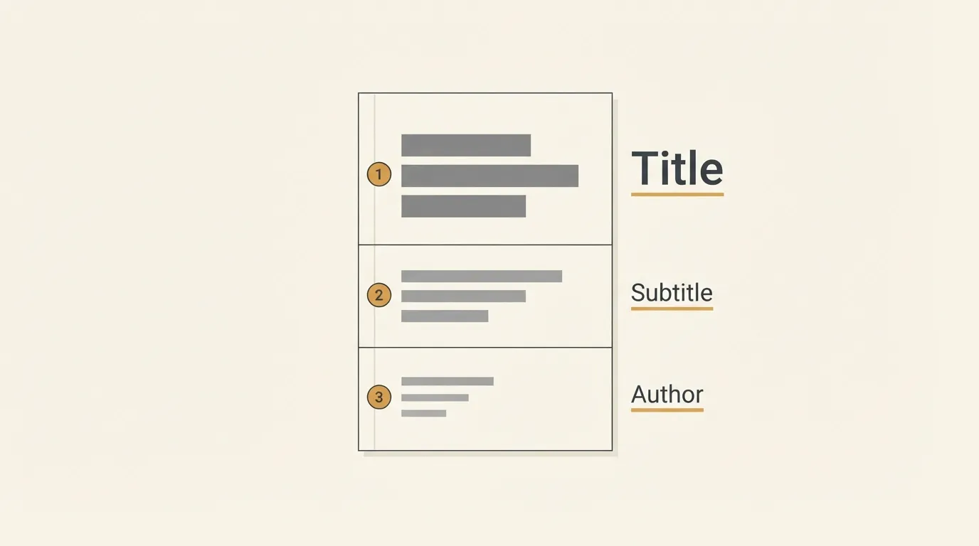
A cover has three text levels. The title gets the largest size and the strongest weight. The subtitle explains the book in a line or two. The author name works as a signature, and its size depends on how well known the author is.
Decide which one the reader should notice first, second and third. For most novels that order is title, author, subtitle. On a non-fiction cover the subtitle may come second, because it tells the reader what they will gain.
Separate the levels with at least two differences, such as size and weight, or size and case. A subtitle only slightly smaller than the title looks like a mistake. Capital letters with wide letter spacing in a plain font make a tidy author name that stays legible when small.
A long title may need two or three lines. Break them where the meaning breaks, not where the width runs out.
Run the thumbnail test on every level. If the subtitle is unreadable, shorten it. If the author name is unreadable, make it larger or darker.
Pairing two fonts on a cover
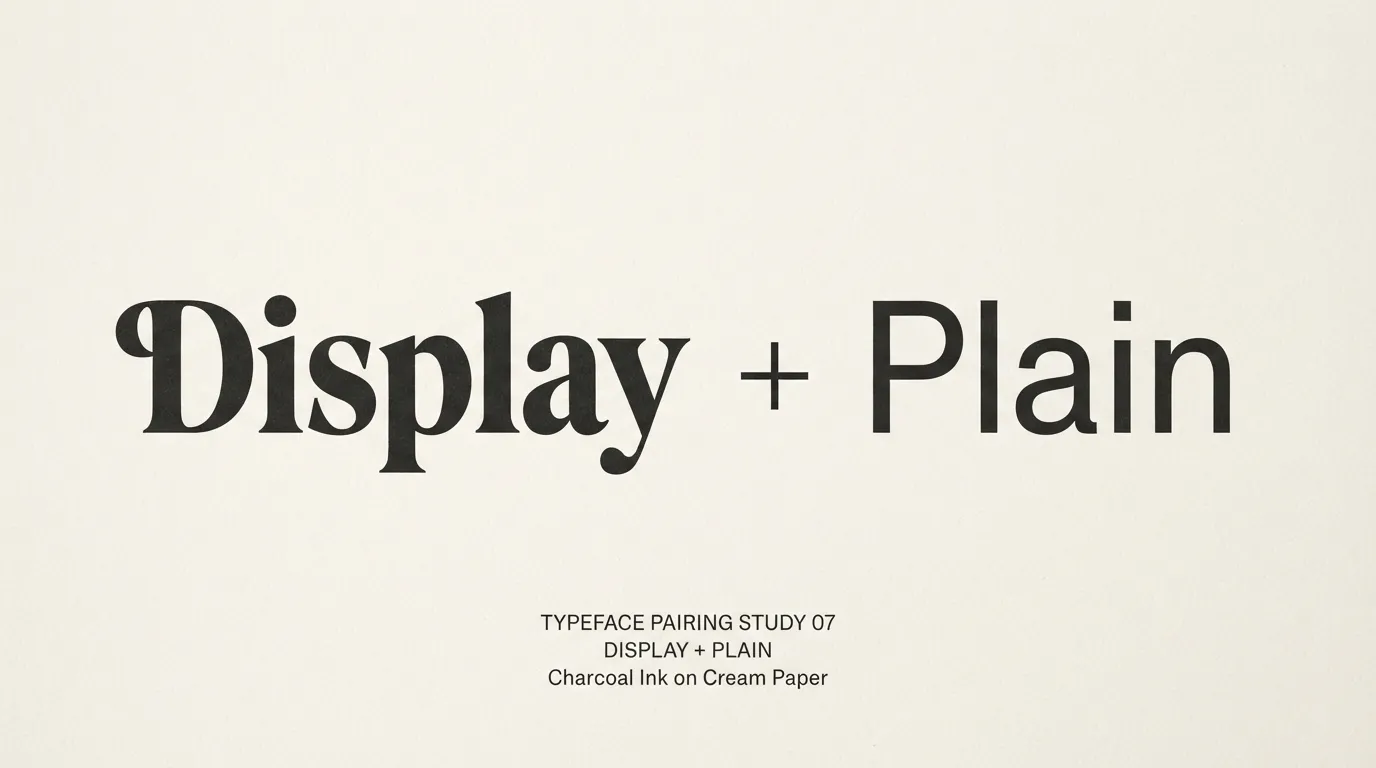
One font can carry a whole cover. When you add a second, give it a clear role: a display face for the title and a quiet workhorse for the subtitle and author name. Pair an expressive title with a plain companion.
Pairings that follow from the catalog pages:
- Playfair Display for the title with Libertinus Sans for the subtitle. Libertinus Sans has 3 styles, and its page calls it friendly and easy to read for captions, headings and UI text.
- A script such as Parisienne or Sacramento for the title with Libertinus Serif in capitals for the author name. Its page describes an elegant text serif for books and long-form reading, with 4 styles.
- Montchauve or Celtica for a fantasy title with Geist or Orkney for the author name.
- Sturkopf Grotesk or Bebas Neue for a thriller title with Fabrik for the tagline.
Avoid two fonts that are similar but not the same, such as two grotesques of slightly different widths, because that reads as an accident. Our Google Fonts pairing map has more pairing logic, and the luxury fonts article shows how high-contrast serifs and scripts combine.
Print and ebook licensing checks
A cover you sell is a commercial project, so the font licence matters. Every font linked in this article is listed on FontCue with SIL Open Font License 1.1 terms and commercial use marked as allowed on its page. Read the licence on each font page before you commit. This is not legal advice.
Before you publish, read the licence text for anything about your use (a print cover, an ebook cover image, promotional graphics) and about handing project files to a designer or printer. Keep a copy of the licence file with the project, so you can show where the font came from.
The font licence covers the font, not the rest of the cover. Stock photos, illustrations and textures have their own terms, and a font from a random download site may carry different terms from the one listed here.
Our guide to free fonts and commercial use explains what to look for on any font page.
It depends on the genre, but the test is the same everywhere: the title must read when the cover is shrunk to a small thumbnail. Heavy grotesques suit thrillers, high-contrast serifs and scripts suit romance, ornamental display capitals suit fantasy, and clean sans-serifs or sturdy serifs suit non-fiction.
It can, but it does not have to. Many covers set the author name in a quieter companion font, often a plain sans-serif or serif in capitals with wide letter spacing, so the title stays the focus. If your title is a script or an ornate display face, a simple font for the name is almost always the safer choice.
Big enough to read in a thumbnail, and clearly smaller than the title. A well-known author can give the name more space, and a debut author usually gives the title the lead. Shrink your cover to a small square and check that both lines are still legible before you settle on sizes.
Check the licence on each font page first. The fonts linked here are listed on FontCue with SIL Open Font License 1.1 terms and commercial use marked as allowed. Read the licence file for the exact terms, because it covers the font only, not the cover art, photos or stock elements you combine it with.
Picking book cover fonts that fit your genre
Choose the genre signal first, then the font. For a thriller, take a blunt grotesque like Sturkopf Grotesk or Bebas Neue and keep the title short. For romance, take Playfair Display or a script such as Parisienne and give the author name a plain companion font. For fantasy, take Montchauve or Celtica and keep the title large on a calm area of the artwork. For non-fiction, take Glacial Indifference or Orkney and spend your effort on a clear subtitle. Whatever the genre, limit the cover to two fonts, separate title, subtitle and author name by size and weight, and run the thumbnail test before you export. Download two or three of these book cover fonts from the serif category, set your title in each, and keep the one you can still read when the cover is the size of a stamp. If you are planning a series, write your choices down once (title font, author-name font, relative sizes) so every cover in the set matches.