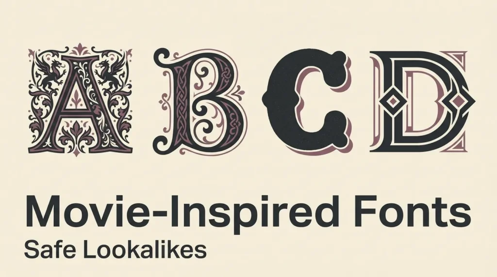
I keep running into the same request: someone wants movie fonts for a birthday invitation, a school project or a fan zine, and they would like it to feel like their favourite film. You rarely need the exact typeface, because most of what makes a title feel like a wizard school or a quest through mountains is shape, spacing and colour. Also, a title logo is a different thing from a font, and copying a famous one too closely is where people get into trouble. This guide skips the hunt for the original and focuses on the traits. It covers what makes wizarding, elvish, chunky animation and sci-fi lettering recognisable, and which free fonts from the FontCue catalog share those traits. I describe looks only and never claim any font is the official one from a film. Fantasy fonts do their best work when you use the style as inspiration and make something of your own, so treat everything below as a starting point and check each license before you publish. I would rather you leave with three or four fonts you understand than a long list you skim, and a short test sheet will tell you more than any description can.
Affiliate Disclosure: If you buy through links on our site, we may earn a small affiliate commission to help support the blog – at no extra cost to you. It never influences our product selection process. Thank you!
- Fantasy and Movie-Inspired Fonts: Safe Lookalikes for Harry Potter, LOTR and Toy Story Styles
- Why a font is not the same as a logo
- Wizarding and storybook styles
- Elvish, runic and calligraphic fantasy styles
- Chunky playful animation styles
- Sci-fi and monster-movie looks
- How to build the look with spacing, color and texture
- Licensing and fan-project safety
- Choosing your movie-inspired look
Get the Free Display Fonts — free download.
Download FontsWhy a font is not the same as a logo
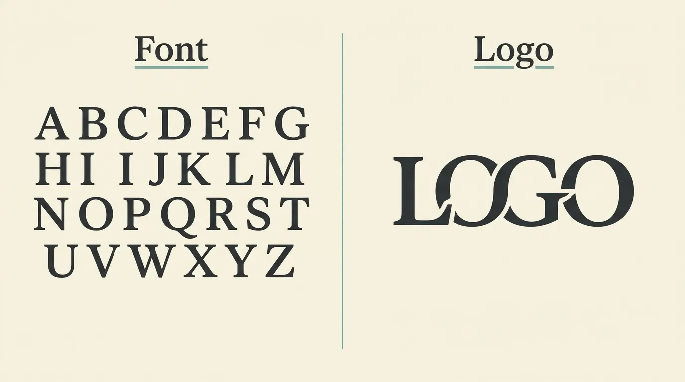
A font is a complete alphabet that you can type with. A film title is usually a logo: a particular arrangement of letters, often redrawn by hand, with custom shapes, effects and a name attached to a brand. When people say they want “the Harry Potter font”, they usually mean a logo style, and a logo style is not something you can download as a keyboard layout.
That distinction is useful for you. Because you are choosing a font and not copying a logo, you can borrow the mood without reproducing the mark. A trademark is about identifying who makes a product, and a font license is about how you may use the font file. A free license on a font does not give you permission to put someone else’s brand name or logo on a product. This is a plain-language outline, not legal advice, so if you plan to sell something, ask a professional.
My rule: take the traits, such as tall capitals, flourishes or chunky rounded shapes, and leave the layout, the artwork and the name behind.
Wizarding and storybook styles
Wizard-school styling tends to rest on a few traits: capital letters with small flourishes, a slightly old-fashioned serif feel, and a warm, parchment mood that comes from colour more than from the typeface itself. You do not need a gothic blackletter to get there. A storybook serif with a decorative capital goes a long way.
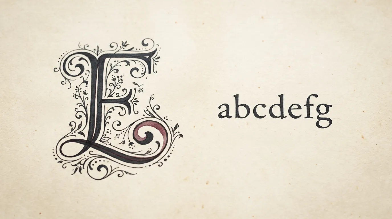
Bury Caps is a good place to start. FontCue describes it as inspired by the display capitals of the 12th-century Bury Bible, with stately lowercase letters and ornate capitals full of whimsical flourishes. Set a title with one big flourished capital and the rest in smaller letters, and you get an invitation-style heading with a storybook air.
Montchauve goes in a different direction. It is a modular titling fantasy font built from repeated geometric parts, and FontCue says its fairy-tale angular letters suit posters, game titles and fantasy book covers. It is better for a few big words than for paragraphs. Cinzel is another option, with classical capital forms that give a quiet, ceremonial tone to a school-of-magic party sign when you add a gold or deep red colour.
For body text under these headings, use something plain. A decorative title and a decorative paragraph together are tiring to read.
Elvish, runic and calligraphic fantasy styles
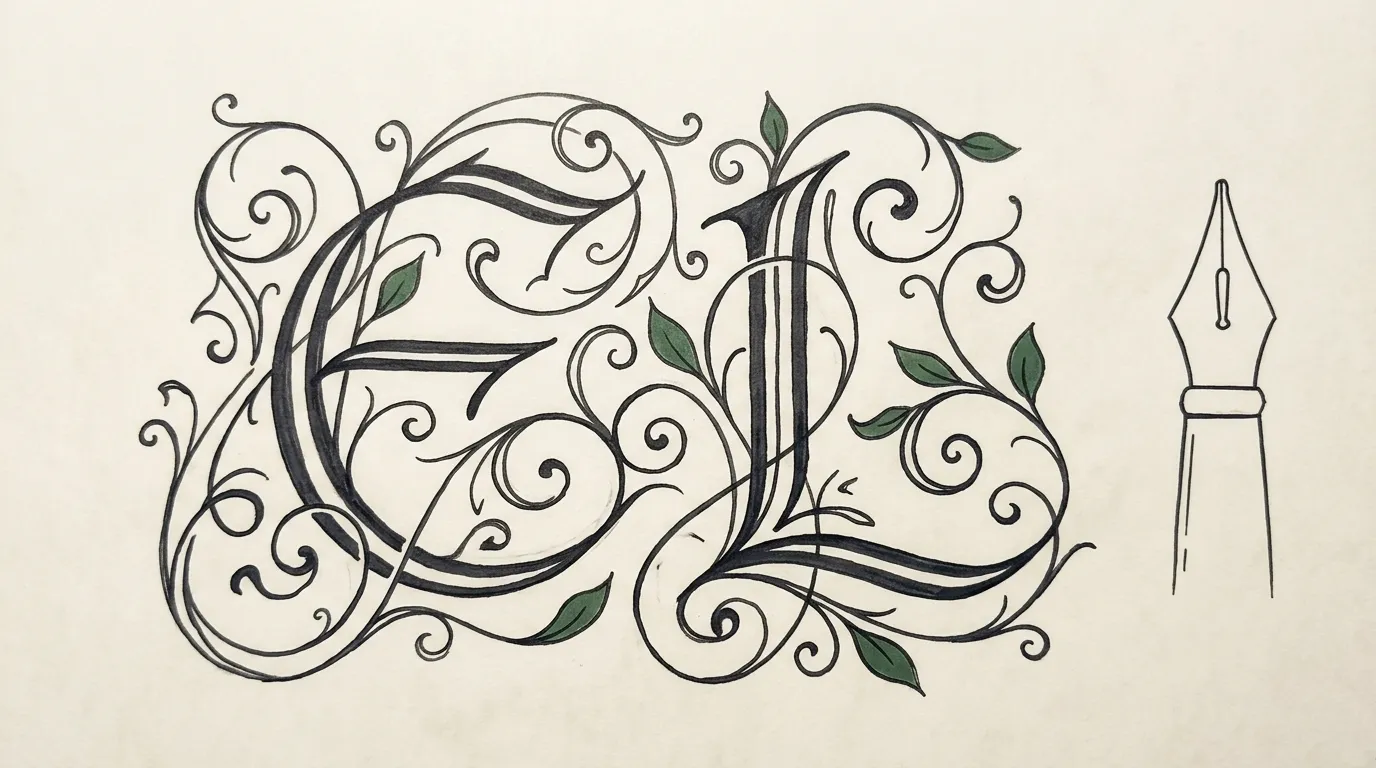
Epic-fantasy lettering looks old and handmade. It leans on pen-written forms, Celtic-style rounded letters and ornament that curls like vines. The shared idea is that nothing looks mechanical.
Celtica is based on uncial, half-uncial and Carolingian scripts, with some glyphs changed by its designer. FontCue describes it as having the look of a medieval manuscript, suited to invitations, fantasy themes and historical projects. It comes in four styles, which makes it easier to build a small hierarchy from one family.
Ouroboros is an ornamental display typeface influenced by Art Nouveau, with a set of alchemical symbols, and FontCue notes its curling decorative capitals suit posters, labels and mystical themes. Curling capitals give you the long, flowing look that people tend to associate with elvish script, without copying any invented alphabet.
If you want a darker, older tone, our guide to Old English and gothic fonts covers blackletter and where it actually works. One caution: if you need readable text for a map, a menu or a game handout, set the long text in a plain serif and keep the fantasy face for the title and a few labels.
Chunky playful animation styles
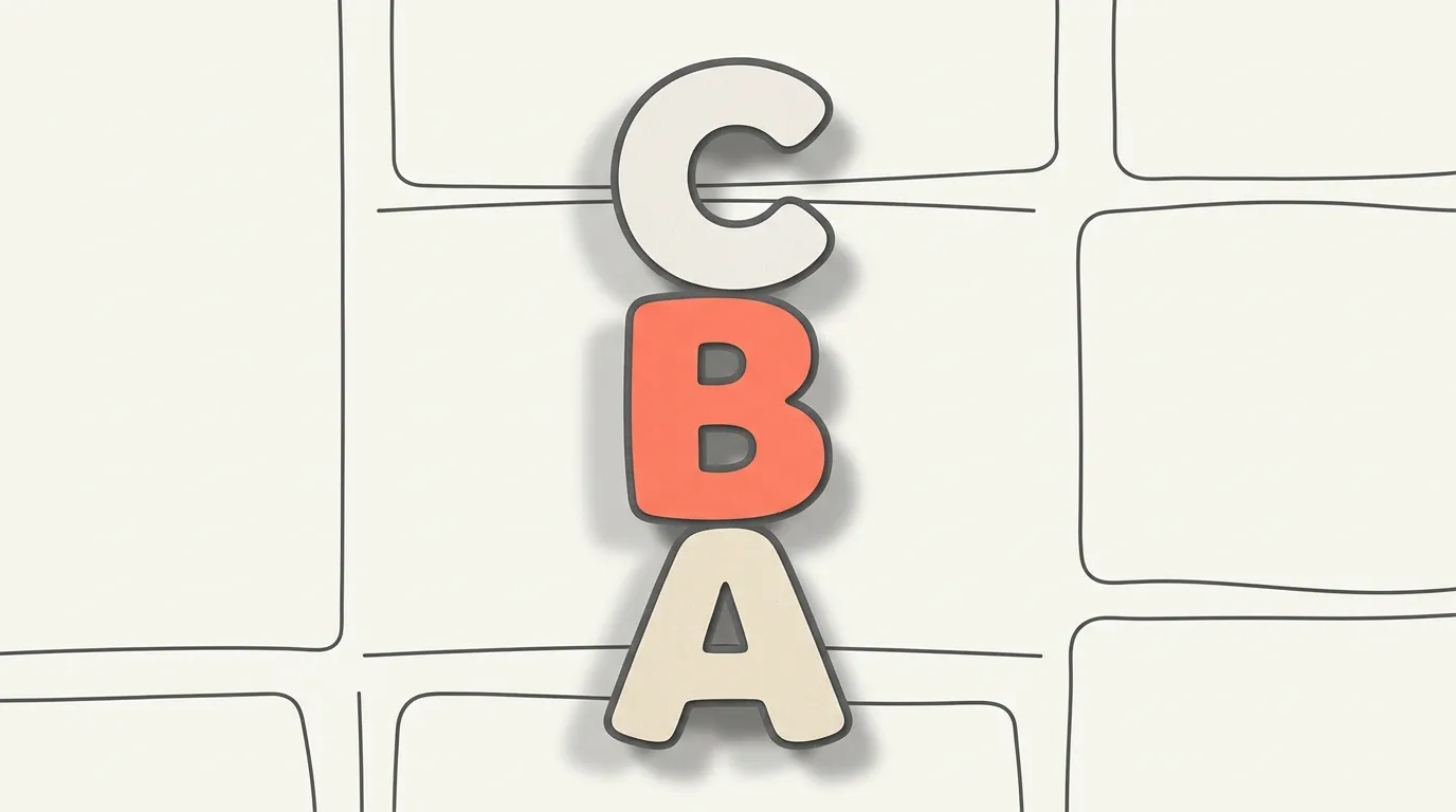
The Toy Story style people ask for is really a family of traits: thick strokes, rounded corners, generous letter size and bright colour. Think friendly, toy-box lettering that looks like it could be made of plastic. You can get this with many fonts, and none of them need to be an exact match.
Lilita One is a heavy, rounded display face that works well at big sizes for birthday banners. Baloo 2 is described on FontCue as a chunky, rounded display font with an ultra-bold bubble feel, aimed at playful headlines and kids’ branding. Fredoka is softer and rounder, which suits smaller subheadings. Emilys Candy adds a candy-striped bubble look for something louder and sweeter. Bangers brings a comic-book energy if your party theme is more superhero than toy.
Chunky styles love colour, and what separates a toy-like heading from a plain bold one is often the outline and the shadow. Our guide to outline, 3D and shadow font effects shows how to fake that depth in common design tools.
Sci-fi and monster-movie looks
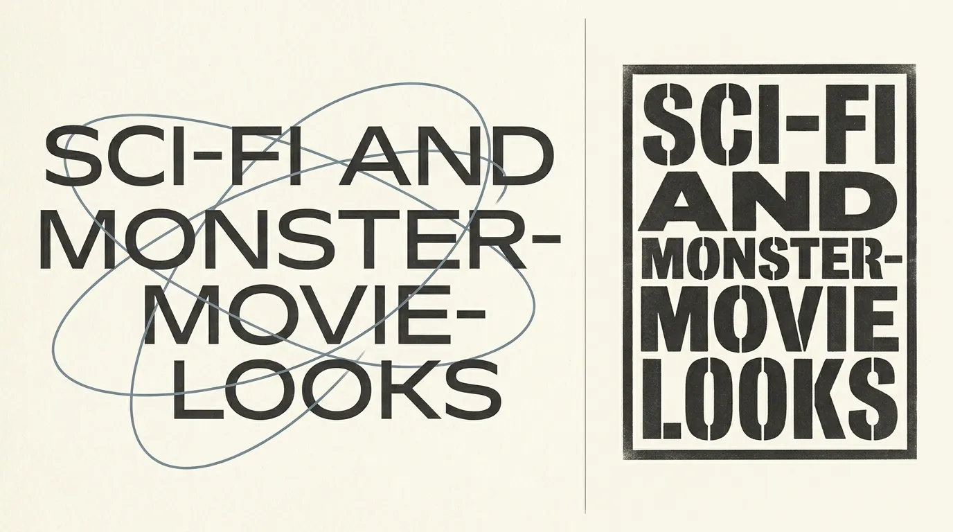
Sci-fi lettering usually means wide, geometric or squared letters with a technical edge. Monster-movie lettering swings the other way: heavy, cramped and blunt, as if the title were stamped on a crate. Both work best at large sizes, with few words.
Orbitron is a geometric display face that reads as futuristic with almost no effort. Unbounded is a wide, rounded display sans that suits space-themed posters. For a more experimental feel, Terminal Grotesque mixes a bitmap-terminal look with the proportions of a classic grotesque, and VTF Gulax is an experimental monolinear sans with unusual proportions, released by the Velvetyne foundry and best used large.
For the monster side, reach for weight. Archivo Black and Passion One are heavy and blunt, and Staatliches gives you tall condensed capitals that stack well on a poster. Pair any of them with a dark background and one strong accent colour, and you have the bones of a creature-feature title.
How to build the look with spacing, color and texture
The font is only part of the job. Spacing, colour and texture matter more than choosing between two similar typefaces.
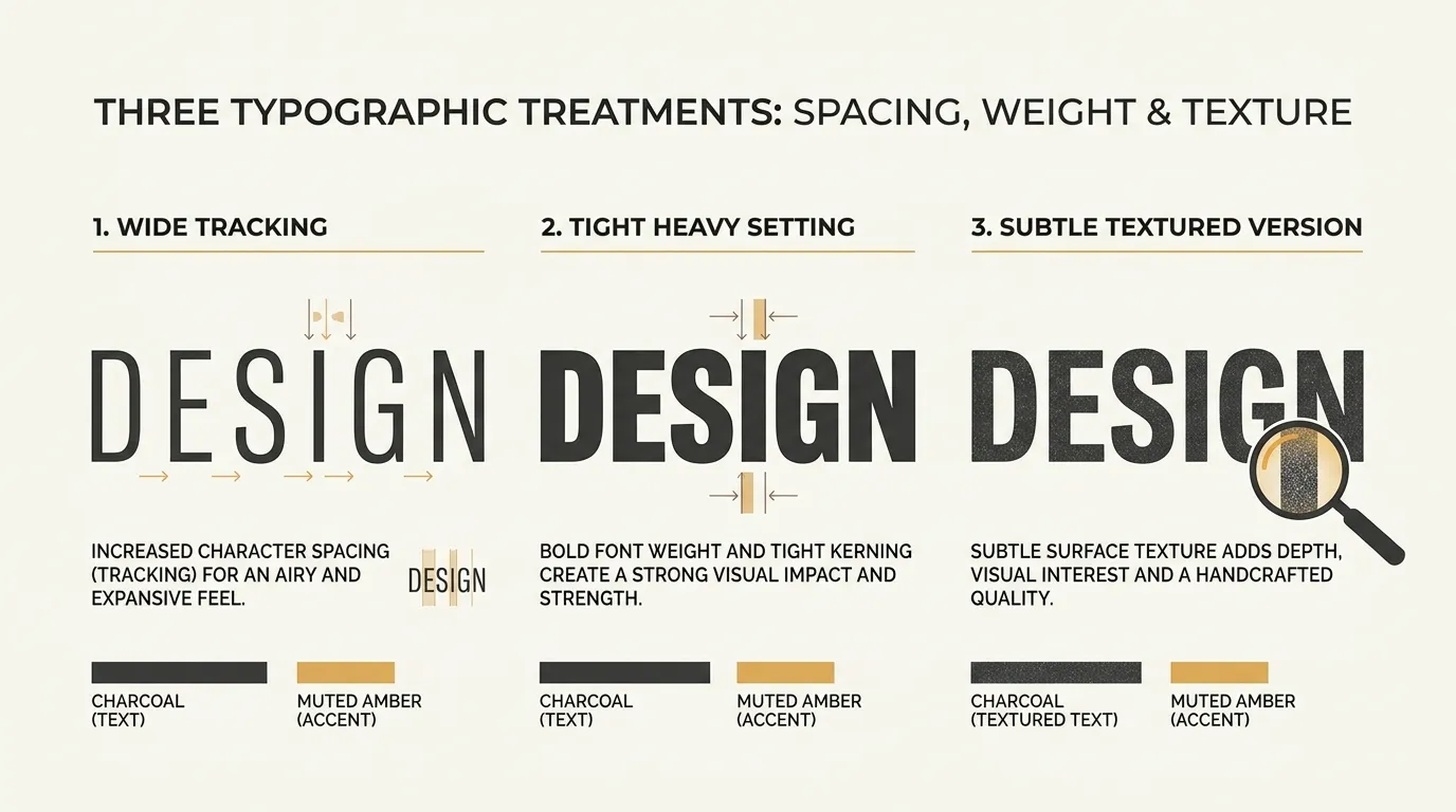
Wide tracking in capitals makes a title feel epic and cinematic, while tight spacing in a heavy face feels loud and playful. Parchment cream, deep red and antique gold read as wizard-school or manuscript, icy blue and silver read as sci-fi, and saturated primaries read as toy-box animation.
Texture helps once the first two are settled. A subtle paper grain behind a manuscript-style heading, a soft glow on a space title, or a thick outline on a chunky word all add depth without changing the letters. Keep effects restrained, since heavy glows and bevels can make text harder to read.
One decorative title, one calm supporting font and plenty of empty space will look more professional than three display faces competing. If pairing feels shaky, the font pairing and hierarchy guide lays out the basics.
Licensing and fan-project safety
Every font linked in this article is listed on FontCue with SIL Open Font License 1.1 terms and commercial use marked as allowed. That is the font file only. Read the license shown on each font page before you print, sell or publish anything, because that page is the source of truth.
Fan projects need a second check. A birthday party for your child or a school play is a very different situation from a shop selling mugs. If you sell anything, avoid film names, character names and recognisable logo layouts in your title, even when you use a free font. A safer route is to invent your own name, such as “The Midnight Library” or “Starlight Quest”, and let the lettering carry the mood.
Our guide to free fonts and commercial use explains what to look for in a license. None of this is legal advice, so for anything beyond a personal project, get a professional opinion.
Choosing your movie-inspired look
Storybook flourishes suit a magical party, uncial and curling capitals suit an epic quest, chunky rounded letters suit a toy-box celebration, and wide geometric or heavy blunt faces suit space and monster themes. Pick one display font that matches, set it large, keep the supporting text simple, and let colour and spacing finish the job. The best movie fonts for your project are the ones that give readers the right mood while staying clearly your own design. Browse the FontCue display category, try three candidates at full size, and keep the one that still looks right when you shrink the headline to phone width. If a title only works when it imitates something famous, change the wording, the colour or the layout until it stands on its own. That habit keeps your project clear of trademark questions, and it usually produces a better design anyway.
Usually the font itself is fine if its license allows your use, since a lookalike is a different typeface. The risk is in what you build with it. Copying a film’s exact logo layout, artwork or name on a product can still raise trademark questions. Check each font’s license page, and ask a lawyer if you plan to sell the result.
Usually a mix of three things: letterforms borrowed from old manuscripts or inscriptions, decorative flourishes on capitals, and uneven or angular shapes that suggest handmade lettering. Add warm color, parchment-like backgrounds and wide spacing, and an ordinary serif starts to read as storybook or medieval.
No. Most of the feel comes from shape, spacing, color and texture, not from one specific typeface. If you match the traits, such as chunky rounded letters or tall elegant capitals, readers get the idea without you copying anyone’s branding.
It depends on each font’s license. The fonts linked in this article are listed on FontCue with SIL Open Font License 1.1 terms and commercial use marked as allowed, but read the license shown on each font page before you print, sell or publish anything.