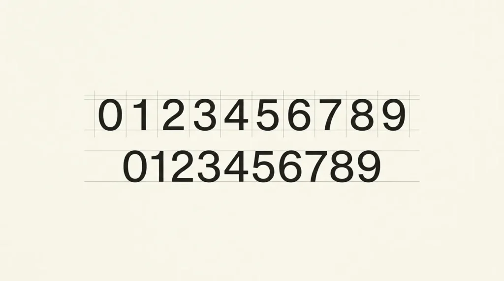
When comparing tabular vs proportional numbers, begin with the job the digits do. Tabular figures share an advance width, which helps with aligned columns and changing counters. Proportional figures use widths suited to the individual digits. Put both into your actual prices or times before choosing.
Affiliate Disclosure: If you buy through links on our site, we may earn a small affiliate commission to help support the blog – at no extra cost to you. It never influences our product selection process. Thank you!
- Tabular vs. Proportional Numbers: Clear Prices, Tables and Timers
- See what equal-width digits change
- Separate lining and oldstyle from spacing
- Fix the table structure as well as the digits
- Turn on the feature in the actual font
- Include punctuation and ambiguous characters
- Keep a small numeric specimen with the project
- Choose figures for a price column or counter
- Frequently asked questions
Figure height is a separate decision. Lining and oldstyle describe how the numerals sit vertically, while tabular and proportional describe their spacing. A font may provide more than one combination. Check the available features instead of searching for an entirely different family at the first uneven column.
See what equal-width digits change
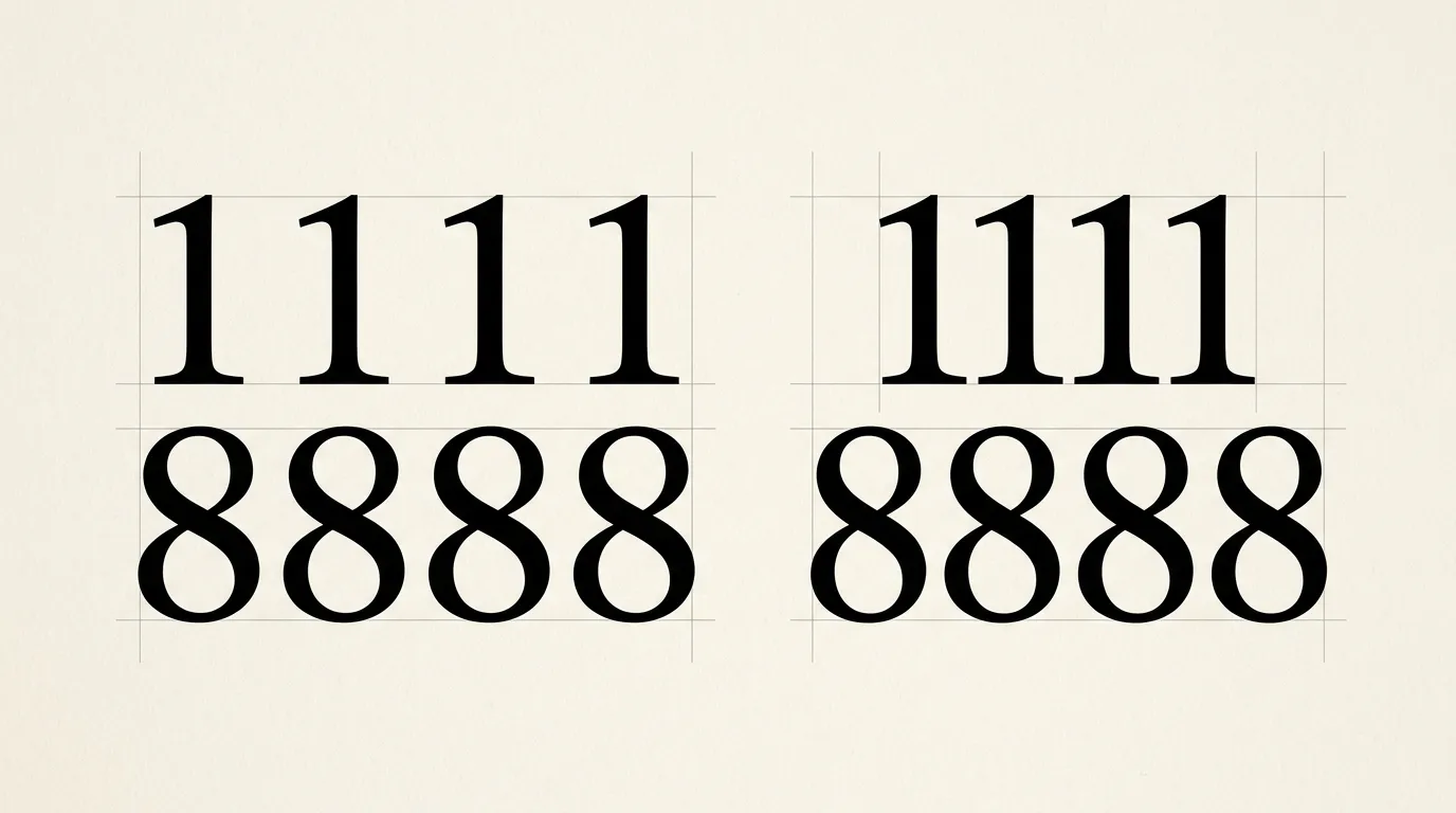
Set 1111 and 8888 in two rows at the same size and weight. If the active figures are tabular, the digit advances are equal. With proportional figures, the widths can differ. Include other combinations because a single pair does not tell you everything about the font.
MDN documents tabular-nums and proportional-nums as numeric spacing options. These select features supplied by the font. They do not guarantee that every font file contains alternate digits.
Equal digit widths can also help you review a changing counter. Compare 11:11, 18:08 and 00:00 in the same component. Watch the surrounding layout as the values change. Keep the colon, container width and alignment fixed so the numeral comparison remains useful.
Separate lining and oldstyle from spacing
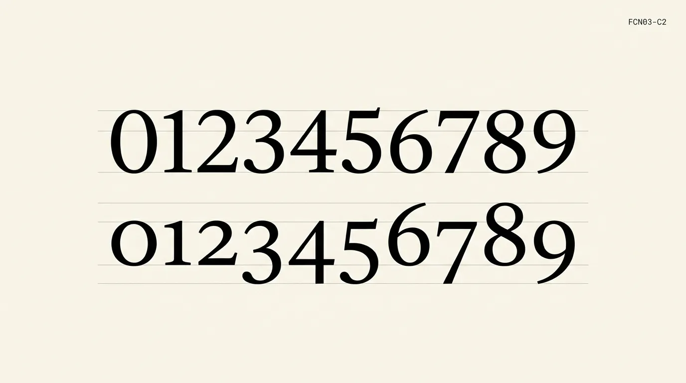
Lining figures have a more uniform vertical arrangement. Oldstyle figures include forms with varying heights and descenders. Adobe’s OpenType reference lists proportional lining, proportional oldstyle, tabular lining and tabular oldstyle as separate options.
For a price table, compare tabular lining first if the font provides it. For a date within running prose, compare the default figures with an available oldstyle set. Treat these as layout exercises, then read the complete sentence or table rather than deciding from isolated digits.
A style sheet should name both dimensions when they matter. “Use lining tabular figures in the price column” gives the next person a repeatable instruction. “Use neat numbers” leaves them to guess which feature you meant.
Fix the table structure as well as the digits
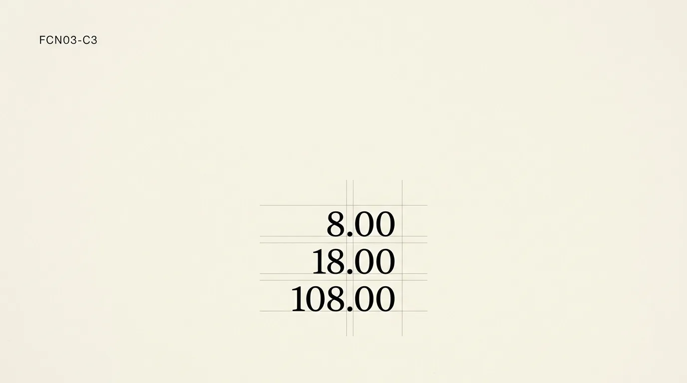
Tabular figures cannot organize an inconsistent table by themselves. Build a sample containing 8.00, 18.00 and 108.00, then decide where the decimal points should sit. Use the application’s table or alignment controls instead of inserting spaces before the values.
Keep the unit or currency treatment consistent within the comparison. An amount followed by a unit, a negative amount and a four-digit total each need room. Include those cases before approving a narrow column from its shortest value.
Choose the number of decimal places according to what the data means. A typography adjustment should preserve the value and required precision. If one row needs a different representation, make that editorial or data decision explicitly and check the labels.
The text-alignment guide helps separate the position of the number’s container from the alignment inside it. Set those choices deliberately before judging the numeral style.
Turn on the feature in the actual font
In a design application, look for the font’s figure-style or OpenType controls. Select the price column and compare the supported options. If the appearance does not change, check the selected text, actual font and feature availability.
For a website, a developer can request font-variant-numeric: lining-nums tabular-nums; for the relevant component. Keep that rule specific to the use. A counter and a paragraph do not have to use the same numeric styling merely because they share a font family.
Ask for a browser specimen showing every digit if you need to verify delivery. An editor preview can use a different file or configuration from the live page. Save the chosen settings alongside the component rather than relying on a screenshot of one amount.
Include punctuation and ambiguous characters
Use the actual separators from the destination content. A decimal point, decimal comma, minus sign, colon and currency symbol can change how a short value reads. Keep the source data intact while reviewing typography.
For codes, inspect zero next to capital O and one next to lowercase l. That identification task goes beyond column alignment. The similar-character checklist gives you a sample to add to the review.
For a large poster price, the surrounding words also matter. Compare the main amount, currency and any qualifier together at viewing size. Use the broader number and symbol reference when the digits carry the visual identity of the design.
Keep a small numeric specimen with the project
Save a column containing short and long values, a negative value and a total. Add changing times if the component has a timer. Label the figure options in the source file and include the final size and weight.
Read the exported specimen or the live page. Check whether the values remain associated with their labels when the screen narrows. A column can align perfectly while the relationship between its amount and description becomes unclear.
Approve the numeric treatment for a named role, such as the invoice amount column. Repeat the check when the font file, data format or component changes. Use the saved specimen to compare the same values after a change.
Choose figures for a price column or counter
Use values that expose width, punctuation and alignment problems before choosing a figure style.
- Collect representative values
Include short and long amounts, required separators, a negative value and any units.
- Check the font features
Find out whether the font supplies tabular, proportional, lining or oldstyle alternatives.
- Compare width and height separately
Change the spacing option first, then compare the available vertical figure styles.
- Set the alignment
Use table or component alignment controls and preserve the meaning and precision of the data.
- Inspect the delivered specimen
Review the exported or live result at its intended size and save the chosen settings by content role.
Frequently asked questions
Tabular figures describe the spacing of the digits. A proportional text font can include a tabular numeral set without making its letters monospaced. Check the available numeric features in the font and apply them to the part of the design that needs aligned figures.
No. Figure height and figure spacing are separate choices. A font can provide tabular oldstyle figures as well as proportional oldstyle figures. Check the available combinations, then compare the actual numbers in their paragraph or table before choosing a convention.
Equal digit widths help, but the layout still needs appropriate alignment and consistent formatting. Compare values with different numbers of digits and decimal places. Use table or component controls to position them and preserve the required precision instead of adding spaces or changing the underlying values.
The font may already use tabular figures, or the selected file may lack the requested alternate set. Confirm the active font and selected text. Compare varied digit sequences, then check the actual delivered output if the editor and website appear different.