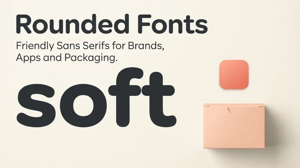
I keep coming back to rounded fonts when a brief says “friendly but not childish”, because the shape does a lot of that work on its own. Take a plain sans serif, sand the sharp ends off every stroke, and the same word suddenly feels warmer, safer and easier to approach. That is the whole trick, and it explains why a rounded sans serif turns up on snack boxes, kids’ apps and wellness brands far more often than on bank letterheads. This guide is about using soft fonts for commercial design, not crafts: logos, interface text and product labels. I will explain what actually makes a typeface rounded, where it helps a brand, where the softness gets in the way, and which free options from the FontCue catalog are worth testing. Every font linked here has its own catalog page, and the details I quote about weights and licensing come from those pages. I will also say where I would not use them, because a soft face on the wrong job looks careless rather than kind. If you want playful hand-drawn lettering for scrapbooks and cards instead, our guide to cute, girly and bubble alphabet fonts is the better starting point.
Affiliate Disclosure: If you buy through links on our site, we may earn a small affiliate commission to help support the blog – at no extra cost to you. It never influences our product selection process. Thank you!
- Rounded Fonts: Friendly Sans Serifs for Brands, Apps and Packaging
- What makes a font rounded
- Rounded fonts for brands and logos
- Rounded fonts in apps and interfaces
- Packaging, kids products and food labels
- Where rounded type falls short
- Pairing rounded fonts with other styles
- FAQ
- Choosing your rounded font
Get the Free Sans Serif Fonts — free download.
Download FontsWhat makes a font rounded
Three features separate a rounded font from an ordinary sans serif. The first is the terminal, the end of a stroke. In a standard sans the terminal is cut flat or at an angle, while a rounded font ends it in a semicircle, like a marker tip. The second is the corner. Some rounded fonts also soften the joins in letters such as M, N and K, while others keep sharp inner corners and only round the ends. The third is geometry: circles and even stroke widths tend to dominate, which is why many rounded faces feel calm and mechanical rather than hand-drawn.
Rounding comes in degrees, and the degree decides the mood. Varela Round takes a low-contrast, humanist sans and rounds off every stroke ending, so it stays gentle without getting cartoonish. Comfortaa keeps a geometric sans-serif’s even proportions and rounds every terminal; the catalog lists 4 styles from Light to Bold. Bubbler One goes a step further with slightly inflated terminals, a bounce the page describes as friendly without going full bubble-letter. At the far end, Sniglet rounds off every corner so aggressively that the letters feel squeezed from soft clay.
A quick test works on any font: zoom in on the end of the letter l and the foot of the letter t. Round ends are easy to spot there, and you can compare candidates side by side before choosing. Rounded is a scale from lightly softened to fully inflated, so decide where your project sits.

Rounded fonts for brands and logos
A logo needs a font that carries a personality at a glance, and softness is a fast way to signal one. Rounded terminals suggest approachability, so the style turns up in brands that want to feel helpful, safe or fun: food, toys, wellness, education and community apps. A plain wordmark in a rounded sans often needs no extra decoration.
The weight you pick matters as much as the family. A medium or semibold weight gives a confident, modern wordmark. Baloo 2 is a bubble display face with thick strokes and soft corners, and the catalog lists 4 weights from Regular to Bold, which lets you test how chunky a logo should be before settling. Mochiy Pop One ships as one bold weight and suits kawaii and dessert branding. Bubblegum Sans is also a single weight, built to be seen rather than read in paragraphs, which makes it a poster-style choice and a poor one for small print.
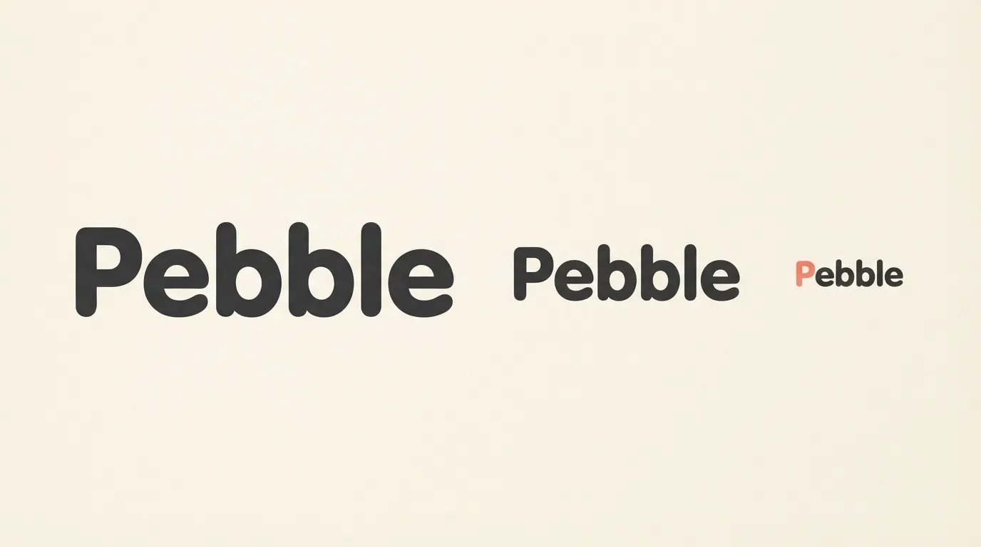
Logos get shrunk, so test the wordmark small. Rounded letters lose their charm if the counters (the enclosed spaces in a, e and g) fill in at favicon size. Set the name at about 16 pixels tall and check that each letter is still distinct. Also set it in one color on a white background before you add gradients or backgrounds. A rounded wordmark that holds up in plain black is much safer than one that depends on its color treatment.
Rounded fonts in apps and interfaces
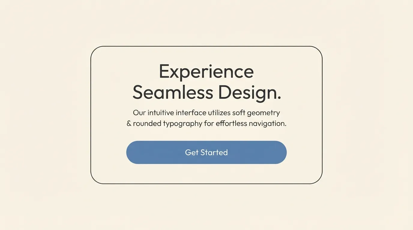
Interfaces ask more of a font than logos do. The text has to work in buttons, menus, form labels and short paragraphs, often at small sizes, so the best rounded options for apps are the restrained ones. A low-contrast rounded sans with open spacing keeps long labels readable while the soft ends give the product a friendly voice.
Varela Round is a good example of the restrained end. FontCue describes it as legible in longer passages and suggests letting it carry the paragraphs while a chunkier face handles titles. The catalog lists it as a single style, so plan on faux bold or a second font if your design needs a heavier weight. For a family with real weights, look at Nunito, listed with 6 styles, and Quicksand, listed with 4. Both are familiar choices for friendly interfaces, and the wider range makes it easier to build a hierarchy from one family.
Bubbler One is another option for interface labels, captions and short paragraphs. The catalog entry says it reads comfortably in longer runs of text, though it lists only 1 style. If you are choosing for a product, our guide to free fonts for websites and UI design compares cleaner sans options and covers screen testing in more depth.
Two practical rules for apps: avoid the heaviest weights for anything longer than a button label, and test numerals, because tabular data and prices look wrong in a very bubbly face. If your product shows code, Maple Mono is a rounded monospace with 6 styles and ligatures.
Packaging, kids products and food labels
Packaging is where rounded type feels most at home. A box on a shelf has about a second to say “this is gentle, sweet and safe”, and soft letters say it without a word. That is why you see them on cereal, snacks, baby products and toys.
FontCue’s own descriptions point the same way. Mochiy Pop One is described as a strong choice for kawaii branding and snack and dessert packaging, Bubblegum Sans for party invitations, children’s book covers and ice-cream branding, and Baloo 2 for kids’ product packaging. Fuzzy Bubbles takes rounded handwriting further, with thick cushiony strokes suited to plush-toy and baby product branding, and lists Regular and Bold. For early-learning material, Delius is simple and rounded, closer to a child’s careful printing than adult cursive.
Packaging has a trap that screens do not: print size and legal text. A rounded display face is fine for the product name, but ingredient lists, warnings and weight statements need a plain, readable sans at small sizes. Set the headline in the soft face and the fine print in a neutral one. The rules for mandatory label text depend on the country and product, so check the requirements that apply to yours before you finalize artwork.
Printing method matters too. Very thin strokes can break up on rough stock, so a medium weight is safer than a light one, and a printer can tell you the smallest size they hold reliably.

Where rounded type falls short
Softness is a tone, and tone can be wrong. Finance, legal, medical and industrial brands often need authority and precision, and a heavy, inflated rounded face can undercut both. A light rounded sans might survive there, but a bubble font usually will not.
Readability is the second limit. Inflated faces such as Bubblegum Sans are built for short bursts, and the catalog says so directly. Thick strokes close up the counters and slow reading in paragraphs. If a font’s own page says it is built to be seen rather than read, believe it.
The third problem is sameness. Rounded sans serifs have become a common look in startup branding, so a plain rounded wordmark may look like a dozen others. Change something: adjust the spacing, redraw one letter, or pair the font with a distinctive color.
Finally, rounded fonts lose precision at tiny sizes, and they can feel immature when the audience expects polish. Test the font with real content, not just the brand name. A name might look charming while a product description in the same face looks messy.
None of this rules out soft type. Pick the degree of rounding on purpose and keep the reader in mind.
Pairing rounded fonts with other styles
A rounded font is already a strong voice, so give it a quiet partner. The simplest pairing is a rounded display face for headlines and a plainer sans for the body. FontCue’s Varela Round page makes the reverse suggestion: let Varela Round carry the paragraphs while a chunkier display font handles the titles. Both rely on contrast of weight.
A serif can balance the sweetness. A soft sans headline over a classic serif body makes a brand feel warm and grown-up at once, and Playfair Display or DM Serif Display can serve as the contrasting voice in a layout. The catalog lists 4 styles for the first and 2 for the second. Keep the serif for large text, since both are display-oriented, and check how they feel next to your rounded choice before committing.
For a modern, clean partner, Inter is a variable sans designed for computer screens with a tall x-height. Set small text and interface details in Inter, and keep the rounded face for the name and key headings.
Three habits keep pairings tidy:
- Use one rounded font per design, because two soft faces compete.
- Differ in weight or structure, so the pair looks planned, not accidental.
- Keep sizes consistent across a hierarchy: headline, subhead, body, label.
Our guide to font pairing and hierarchy goes deeper on contrast and scale, and our guide to poster fonts shows how heavy headline faces behave in layouts.

FAQ
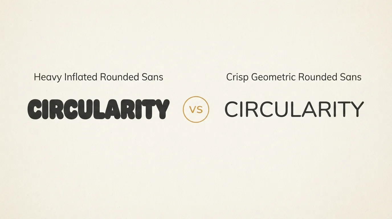
A rounded sans serif keeps ordinary letter proportions and only softens the stroke ends, so it still reads well in paragraphs. A bubble font inflates the whole letter into a puffy shape, which suits short headlines but tires the eye in running text. Many catalog fonts sit between the two, so judge them at the size you plan to use.
Some are. Low-contrast rounded sans serifs with open spacing hold up in paragraphs, and FontCue describes Varela Round as legible even at body-text sizes. Single-weight bubble faces do not, because heavy strokes and tight counters tire the eye. Set a sample paragraph at your real size before you commit.
Not by themselves. The tone depends on weight and spacing. A light or regular rounded sans with calm spacing reads as friendly and modern, while a heavy inflated one reads as playful. Match the softness to the audience: it suits a children’s app more easily than a law firm.
Check the license on each font’s FontCue page first. The fonts linked in this guide are listed there with SIL Open Font License 1.1 terms and commercial use marked as allowed. The license covers the typeface only, so read the terms again for your specific print or app use.
Choosing your rounded font
Start with the audience, then the job. A children’s product wants a bubbly face for the name and a calm one for everything else. An app wants a restrained rounded sans with real weights. A premium food brand may want only a hint of softness and a serif partner to keep it grown-up. Open three candidates from the sans serif category, set your actual brand name and a real line of body text in each, shrink them to small size, and keep the one that still looks friendly when it is least flattering. Rounded fonts earn their place when the softness is chosen on purpose. Before the artwork goes to a printer or a developer, read the winner’s license on its catalog page, and keep a copy of the license with the project files. If a client later asks which fonts the packaging or app uses, you will have the answer and the terms ready.