
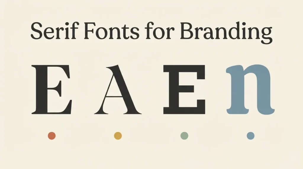
Serif fonts get lumped together as “traditional” or “fancy,” but that flattens a category that actually splits into at least four different moods. I’ve watched clients pick a serif because it “felt classic” and then wonder why their bakery logo reads like a law firm. Good serif font branding design starts by picking a mood on purpose, not by grabbing whatever serif looks nice on a moodboard. An editorial serif and a luxury display serif share the same basic anatomy, small feet at the ends of each stroke, and still send completely different signals to a customer. This guide breaks serif branding fonts into the four styles that matter for logo and brand work, editorial, elegant, organic/warm, and rounded hybrid, so you can compare them side by side before committing to one.
Affiliate Disclosure: If you buy through links on our site, we may earn a small affiliate commission to help support the blog – at no extra cost to you. It never influences our product selection process. Thank you!
- Serif Fonts for Branding: Editorial, Elegant, Organic and Warm Styles
- Why “serif” isn’t a single branding look
- Editorial serif fonts for a publication-grade brand
- Elegant serif fonts for luxury and high-end brands
- Organic and warm serif fonts for a human, approachable feel
- Rounded sans-adjacent serifs for a softer hybrid look
- How to pick a serif style before you commit to a logo
- Serif style comparison table
Get the Serif Branding Font Pack — free download.
Download FontsWhy “serif” isn’t a single branding look
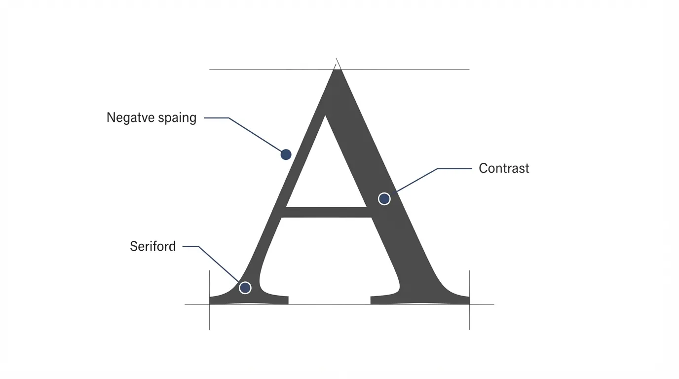
A serif is just a small stroke at the end of a letter’s main lines, and that single detail covers an enormous range of typefaces. A high-contrast fashion serif with hairline thin strokes and a warm, rounded slab serif with even weight both technically qualify as “serif,” but a customer reads them as opposite personalities on sight.
What separates one serif mood from another is a handful of measurable traits: how much the stroke weight varies between thick and thin, how sharp or soft the serifs themselves are, how wide or narrow the letters sit, and how much space runs between characters. A high-contrast, narrow serif with sharp terminals reads as fashion-editorial or luxury. A low-contrast, wider serif with soft terminals reads as warm and approachable. Neither is more correct. They just aim at different brand personalities.
The four categories below aren’t the only way to slice serif fonts, but they cover the moods that come up most often in logo and branding work: editorial, elegant, organic/warm, and a rounded hybrid that sits between serif and sans. Picking one on purpose, based on what a brand needs to communicate, beats picking one because it “looks nice” on a moodboard.
Editorial serif fonts for a publication-grade brand
Editorial serifs are built first for reading, not for looking dramatic in a logo lockup. They come from newspaper and magazine typography, where a serif has to stay legible across dense paragraphs, small captions, and long headlines without tiring the eye.
Spectral is a good example of this category. It was designed specifically for screen-first, text-heavy reading, ships in seven weights with true italics, and holds its shape at small sizes better than most display serifs do. For a brand, that makes it a strong fit for anything that reads like a publication: a newsletter masthead, a content-heavy website, a magazine-style Instagram grid, or a brand voice built around long-form writing rather than a single punchy tagline.
The tell for “editorial” over “elegant” or “warm” is restraint. An editorial serif rarely has flourishes, rarely goes ultra-thin, and almost always ships with a matching italic built for emphasis inside a sentence rather than for decoration. If your brand’s main job is to be read, not just glanced at, start here before looking at flashier serif categories.

Elegant serif fonts for luxury and high-end brands
Elegant, luxury-coded serifs lean the opposite direction from editorial ones. High contrast between thick and thin strokes, sharper serifs, and tighter spacing all read as refined and expensive, the same visual cues that show up in fashion magazine logotypes and jewelry branding.
Prata is a clear example: a high-contrast Didone-style serif with organic teardrop terminals instead of perfectly geometric ones, which keeps it from feeling cold the way some ultra-precise luxury serifs can. That small amount of organic irregularity is often what separates “elegant” from “stiff” in this category. A logo set in a pure geometric high-contrast serif can look austere; one with slightly organic terminals like Prata’s keeps some warmth while still reading as upscale.
This category works best in low quantities. A luxury serif carrying a full paragraph of body copy usually strains legibility, since the thin strokes that make it feel refined at headline size can disappear at text size. Reserve it for the wordmark, a short tagline, or a monogram, and pair it with a plainer serif or sans for everything else.

Organic and warm serif fonts for a human, approachable feel
Warm serifs trade contrast and sharpness for evenness and softness. Where a luxury serif thins out dramatically between strokes, a warm serif keeps its weight fairly consistent, and its serifs tend to be rounder or chunkier instead of hairline-thin.
Bitter is a humanist slab serif built with exactly this in mind: sturdy, even strokes designed to hold up on a screen, without the sharpness that would push it toward “fashion” territory. That evenness is what reads as approachable rather than aloof. A bakery, a small farm brand, a wellness studio, or a handmade-goods shop tends to reach for this register because it signals “made by a person,” not “engineered by a design studio.”
The practical advantage of this category is durability at small sizes. Because the strokes don’t vary much in weight, a warm serif tends to survive shrinking down to a product label or a social media avatar better than a high-contrast luxury serif does, where the thin strokes are the first detail to disappear.
Rounded sans-adjacent serifs for a softer hybrid look
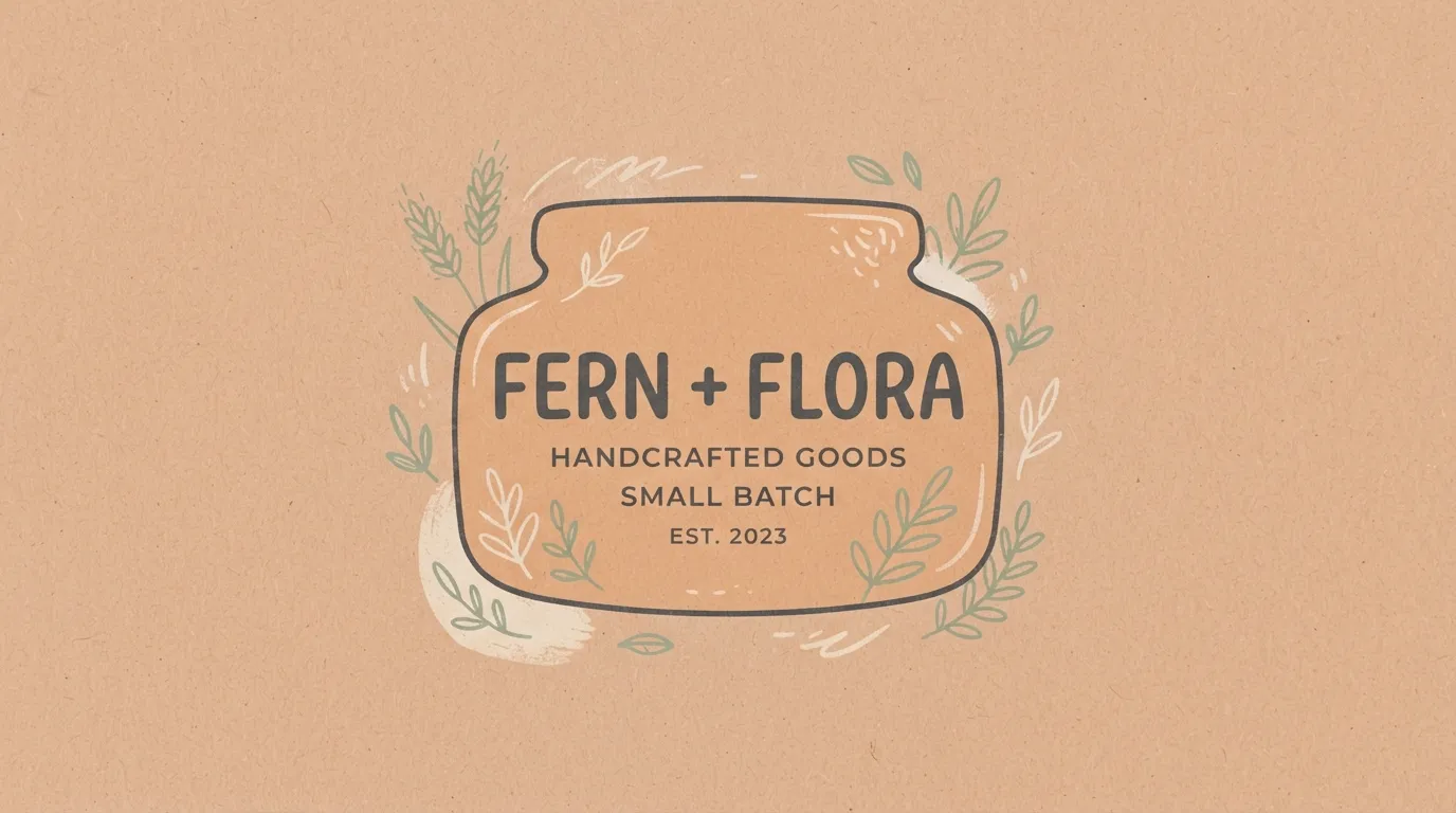
A smaller, useful category sits between serif and sans entirely: fonts with softened, rounded serifs that read almost like a sans-serif with just a hint of traditional structure left in. These split the difference when a brand wants some of a serif’s credibility without its formality.
Crete Round fits this slot. It’s a warm slab serif with deliberately rounded terminals, so it keeps a serif’s grounded, structured feel while losing the sharp edges that push a font toward “formal” or “editorial.” The result reads closer to a friendly sans than a classic serif, which is exactly the appeal: a brand that wants to feel current and casual but still slightly more considered than a plain grotesque sans can land here.
This hybrid category tends to work well as a headline font paired with a genuinely plain sans for body copy, rather than as the only typeface in a system. Two rounded, soft-edged fonts stacked together can start to feel undifferentiated, so keep the contrast between the headline and body roles clear even when both lean soft.

How to pick a serif style before you commit to a logo
Before locking in any of the four categories above, run the choice against what the brand actually needs to say, not just what looks good in isolation. This is where serif font branding design actually gets decided, not in the moodboard stage. A few practical questions cut through most indecision.
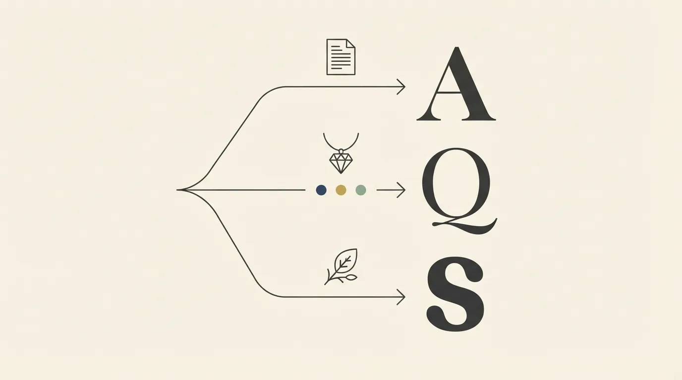
Does the brand’s main job involve being read in bulk, like a blog, newsletter, or content-heavy site? Lean editorial. Is the product priced at a premium, and does the brand need to signal exclusivity in a glance, like jewelry, fashion, or a boutique service? Lean elegant. Does the brand want to feel handmade, personal, or approachable, like food, wellness, or small-batch goods? Lean organic and warm. Does the brand want a current, slightly casual feel while still keeping some structure, like a modern lifestyle or hospitality brand? Lean rounded hybrid.
It also helps to test the front-runner at the size it will actually ship at, not just at logo scale. A serif that looks striking as a 400-pixel wordmark can behave very differently as a 40-pixel favicon or a one-inch product label. If the shortlist survives both sizes, it’s a safe pick. If one style only works large, either simplify it for small applications or choose from a lower-contrast category instead.
Serif style comparison table
| Style | Mood | Weight range | Best use case |
|---|---|---|---|
| Editorial | Considered, publication-grade | Light to medium, consistent contrast | Newsletters, content-heavy sites, magazine-style brands |
| Elegant | Refined, high-end | Thin to bold, high contrast | Logos, monograms, luxury and fashion wordmarks |
| Organic/warm | Human, approachable | Medium, low contrast | Food, wellness, handmade and small-batch brands |
| Rounded hybrid | Soft, current | Medium to bold, low contrast | Lifestyle and hospitality headlines, casual-but-considered brands |
An editorial serif is built to be read in paragraphs: moderate contrast, matching italics, and spacing that holds up at small sizes. A display serif is built to be looked at, not read in bulk, so it can have sharper contrast, tighter spacing, or more personality, because it usually only has to carry a headline or a wordmark, not a page of copy.
Yes. What reads as “modern” in a serif has more to do with proportion and spacing than with the serif itself. A serif with even weight, generous letter spacing, and a simple color palette reads current, while the same letterforms set tight and ornate reads dated. Pairing a serif headline with a clean sans-serif support line also pushes the whole system toward modern.


