Line breaks and hyphenation affect where readers pause and how a text block fits. Before forcing a break, check whether the problem comes from the wording, column width or a long unbroken string. Preserve the meaning and review the revised text at every intended width.
Affiliate Disclosure: If you buy through links on our site, we may earn a small affiliate commission to help support the blog – at no extra cost to you. It never influences our product selection process. Thank you!
- Line Breaks and Hyphenation: Fix Awkward Headings and Narrow Columns
- Identify the kind of wrapping problem
- Use manual breaks for a controlled composition
- Check language before enabling automatic hyphenation
- Give long links a way to fit
- Compare balanced heading wraps with natural phrase groups
- Keep overflow visible while diagnosing it
- Save examples at the widths you support
- Review wrapping before approving a heading or column
- Frequently asked questions
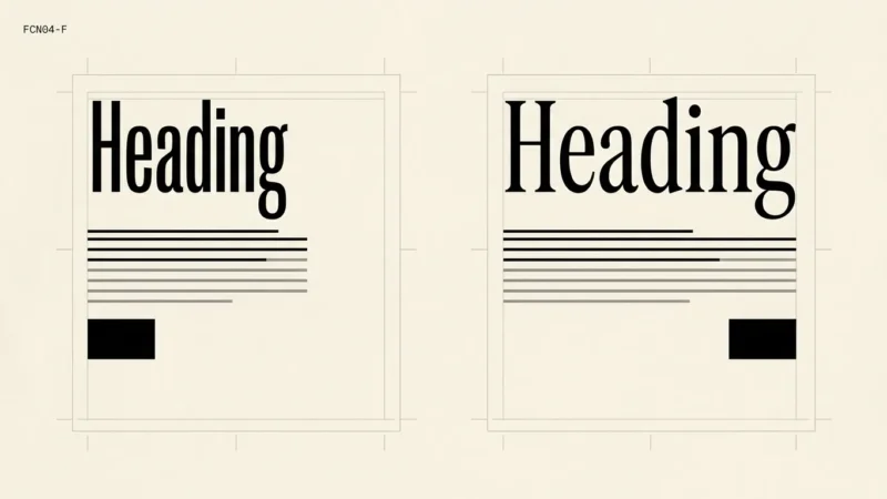
A poster title with a deliberate two-line composition gives you more control than a responsive website heading. Decide which kind of layout you are editing. A break that improves a fixed invitation can leave a narrow web card with an awkward fragment.
Identify the kind of wrapping problem
Copy the affected text into a simple specimen with its original font, size and width. Remove decorative elements from the comparison so you can see the line endings. Note whether the issue is a single short last line, a split name or a string that extends beyond the box.
Choose the wrapping control for the problem you can see. A short last line may respond to revised wording or width. A name may need a deliberate editorial choice. A long URL needs a way to wrap safely while keeping the destination intact.
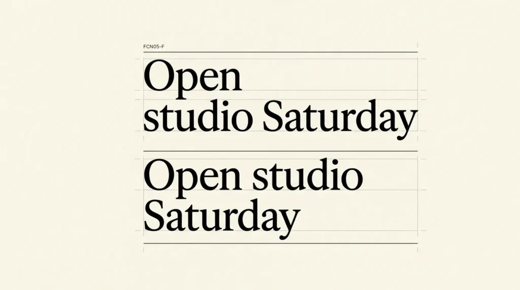
Read the phrase aloud before moving words between lines. Keep the number and its unit, an event name or another meaningful group together when the layout permits. If doing that leaves too little space, compare a wider text box or shorter approved wording.
Use manual breaks for a controlled composition
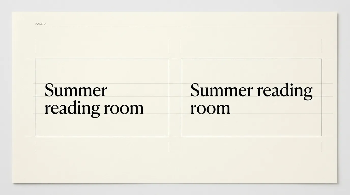
For a fixed poster, try a break where the phrase still makes sense. Compare the complete title with the subtitle and date visible. A visually balanced title is less useful if its second line seems to belong to the next item.
Keep an unbroken source version. If the same copy will also become a mobile card or translated heading, create a specimen for that use instead of carrying the poster’s breaks across automatically.
On the web, forced breaks and automatic wrapping are different controls. MDN’s text-wrap reference explains that the browser controls soft breaks while the author can insert forced ones. Review the actual widths before making an explicit break part of the content.
Check language before enabling automatic hyphenation
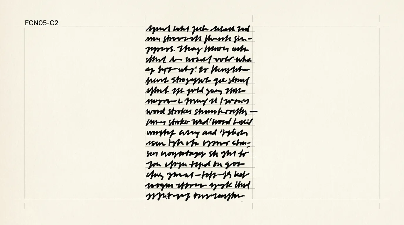
Hyphenation lets a word continue onto the next line with a visible hyphen at the break. It can be worth comparing in a narrow text column, especially when a long word repeatedly leaves a large empty space at the line end.
MDN documents hyphens: auto and its dependence on the correct language tagging and an available hyphenation dictionary. The result can vary across browsers. Check the real language and output instead of assuming every environment will choose identical breaks.
Read several paragraphs after enabling it. Inspect names and the places where consecutive lines end with hyphens. Ask a fluent reader to review language-specific decisions you cannot judge. A cleaner right edge alone does not establish that the words have been broken appropriately.
Give long links a way to fit
An unbroken reference or URL can extend beyond a narrow box. The CSS overflow-wrap property allows an otherwise unbreakable string to wrap when needed. The value anywhere can introduce a break without inserting a hyphen.
Keep this problem separate from ordinary word hyphenation. A broken visual line in a URL should not change the link destination. Where the full address is unnecessary, a concise descriptive link label can make the paragraph easier to read.
Check a copied reference as well as its appearance. If readers need to transcribe an identifier, make sure the line break does not look like an extra character in the value. Keep the original string available in a form suited to that task.
Compare balanced heading wraps with natural phrase groups
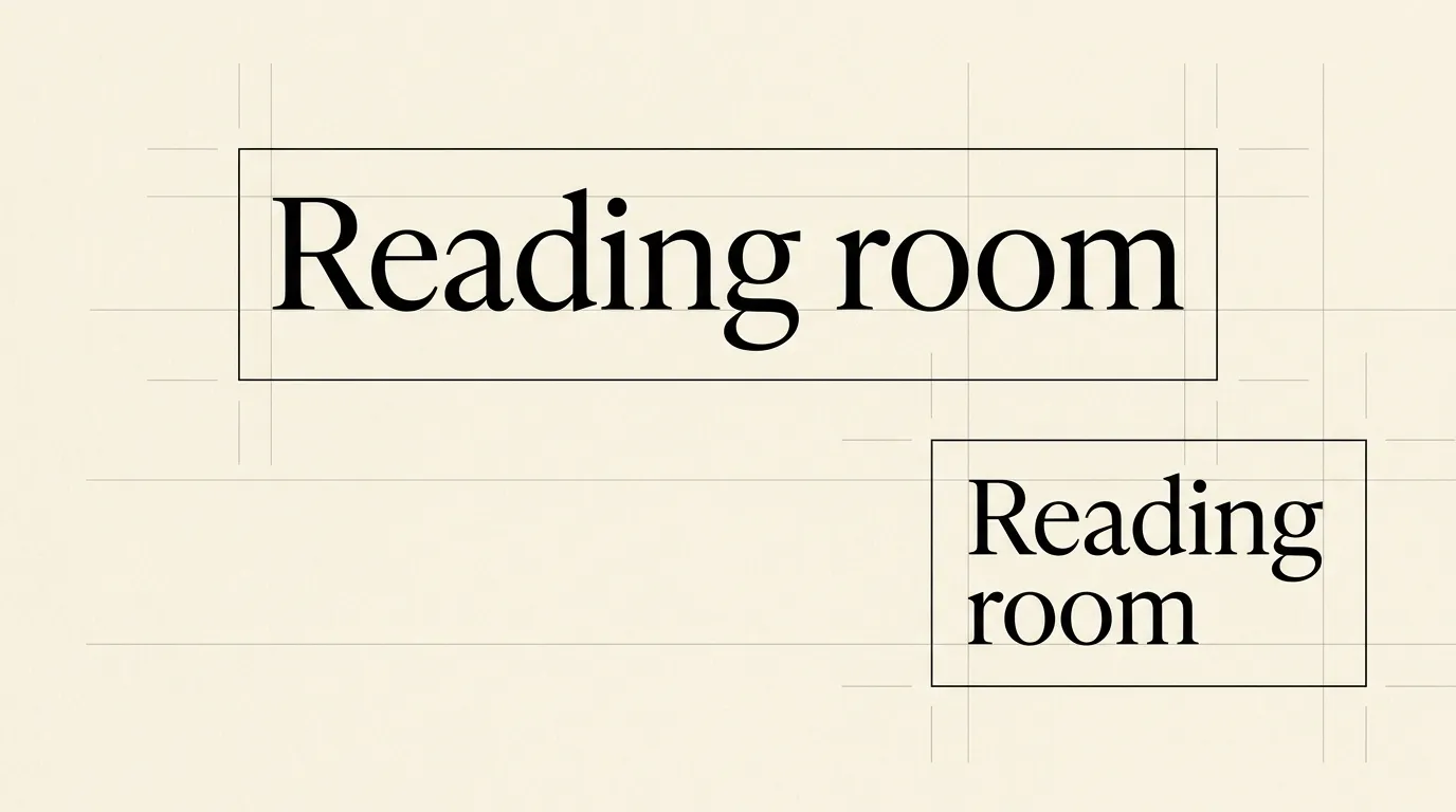
A browser can help balance a short heading through text-wrap: balance. Treat it as a candidate for the layout, then read the resulting phrase groups. A more even shape can still place a word on a line where you would prefer a different pause.
Start the component check with its longest realistic title. Add a shorter title and a title containing a long name. This exposes cases that a two-word placeholder cannot show. Review the effect in the target browsers and keep ordinary wrapping usable where the chosen behavior is unavailable.
Keep the heading’s size and weight unchanged during the first comparison. If you later adjust those settings, repeat the wrap check. The font-weight guide helps you separate an emphasis decision from a fitting problem.
Keep overflow visible while diagnosing it
Clipping a text box can hide the evidence of a bad fit. MDN’s wrapping guide explains why overflowing content is generally visible by default: hidden content can be lost. During review, inspect every word that approaches the edge.
For a card with a strict space limit, decide how much text the component needs to show. If shortening is appropriate, edit the wording or use an explicit content policy. Check that essential names, amounts and instructions remain understandable.
Compare the available width before shrinking the text. Use the spacing and line-length guide to review the column, and the alignment guide if justification produces distracting gaps.
Save examples at the widths you support
Keep a small set containing a long heading, a normal paragraph and an unbroken reference. Include the actual language and punctuation. Save the content itself alongside screenshots so later editors can reproduce the check after a font change.
Review the text at the narrow layout, at a wider layout and with enlarged text. Check the line groups, complete wording and relationship to neighboring elements. Record any deliberate break as a content decision tied to its intended destination.
When revising a component, start with these difficult examples. A new heading treatment is ready for approval when the long title and reference remain usable alongside the short examples that looked good from the beginning.
Review wrapping before approving a heading or column
Keep the content intact while comparing automatic wrapping, deliberate breaks and long-string handling.
- Identify the failure
Note whether the issue is an awkward phrase break, a long word or an unbroken string that overflows.
- Compare wording and width
Keep the type settings fixed while trying the available column width and approved wording.
- Select the appropriate control
Use a deliberate break for a controlled composition, language-aware hyphenation for words or safe wrapping for long strings.
- Review target layouts
Inspect narrow and wide layouts, enlarged text and the actual language in the intended output.
- Save difficult examples
Keep long headings and references with the component and record the reason for any manual break.
Frequently asked questions
Use an explicit break when it belongs to a deliberate composition and survives the intended layouts. Responsive headings need checking at several widths. Keep an unbroken source version and compare natural wrapping before making a desktop line arrangement part of the content.
Check the text language, language tagging and the availability of a suitable browser dictionary. Also inspect whether another wrapping rule prevents the expected behavior. Compare the actual content in the target environment instead of assuming that one setting will produce the same result everywhere.
No. Long-string wrapping can allow a visual break without adding a hyphen, while language-aware hyphenation splits words according to language rules. Keep the link destination and original identifier intact, and verify that the display does not suggest an extra character in the value.
A balanced shape still needs an editorial review. Read the phrase groups and compare the longest realistic title in the component. Check names and punctuation at the target widths, then keep ordinary wrapping usable if the browser does not apply the requested balancing behavior.