Three letters, arranged well, can carry an entire brand or an entire wedding day. A monogram says a name without spelling one out, in a shape small enough to fit on a ring, a napkin, or a favicon. The tricky part is that not every font that looks good in a headline works the same way once it’s reduced to just initials. Monogram fonts and plain display fonts get treated as interchangeable more often than they should be, and that’s usually where a design goes wrong.
Affiliate Disclosure: If you buy through links on our site, we may earn a small affiliate commission to help support the blog – at no extra cost to you. It never influences our product selection process. Thank you!
- Monogram and Initial Fonts: Logos, Wedding Monograms and Gifts
- What makes an initial font work as a standalone mark
- Monogram fonts for a minimal logo mark
- Wedding monogram fonts for invitations and signage
- Interlocking vs. framed vs. stacked initials
- Initial fonts for personalized gifts and packaging
- 3-letter monogram layout guide (order, size, spacing)
- FAQ
- Related reading
I think the mistake happens because a monogram looks like the easy part of a project, just three letters, how hard can it be. In practice it’s closer to the opposite. A full word gives a reader context to fill in gaps, but a monogram has to be recognized instantly with nothing around it, at whatever size it ends up shrunk to. A font that reads beautifully across a headline can turn into a smudge once it’s carrying just two or three initials on a ring or a gift tag.
This guide covers what actually makes a monogram or initial font hold up, how to choose one for a logo mark, a wedding suite, or a personalized gift, and a simple layout guide for getting a 3-letter monogram’s order, size, and spacing right the first time. It comes down to matching the font to the surface it will actually live on, not to finding one perfect font.
Get the Monogram & Initial Font Pack — free download.
Download FontsWhat makes an initial font work as a standalone mark
A monogram strips a name down to its bare minimum, so the font carrying that weight needs a distinct enough shape to still read clearly with almost nothing around it. A word has context. A single initial, or three initials sitting close together, doesn’t get that help, so the letterform itself has to do all the work.
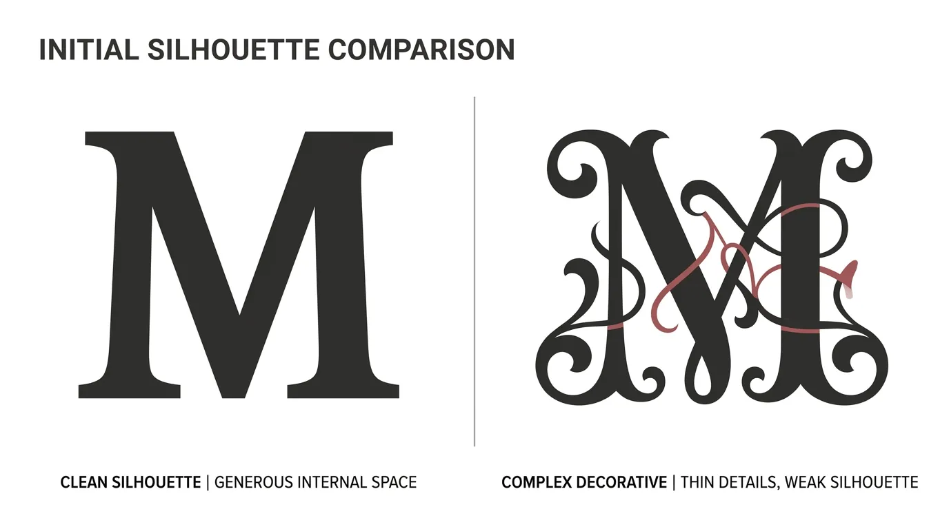
The first thing to check is silhouette. A font with a simple, closed, recognizable outline for each capital letter, especially rounded letters like O, C, and G, holds up better at small sizes than a font with a lot of internal detail or thin decorative flourishes. The second thing is spacing behavior. Some display and script fonts are drawn to connect into words, and their letters were never meant to sit isolated next to other isolated letters, so a font built for word-length text can look oddly cramped or oddly spaced once it’s just two or three initials.
The last check is scale. A monogram often ends up somewhere tiny, stitched on a towel corner, printed on a return-address label, or shrunk into a social media avatar. Test any candidate font at the smallest size it will actually be used at before committing, the same rule that applies to any print or digital design work.
Monogram fonts for a minimal logo mark
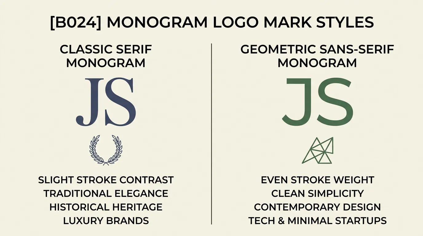
A logo built from initials needs to work as a mark first and a font second, meaning it should be recognizable even when someone glances at it for half a second on a phone screen. Classic serif capitals and geometric sans-serif capitals both tend to perform well here, because their letterforms are built around clean, simple structure rather than added ornament.
Serif monogram marks lean formal and established, which fits professional services, law firms, and legacy-style brands well. A serif’s small structural details, like serifs and slight stroke contrast, still register at logo size without collapsing the way a script’s connecting strokes can. Geometric sans-serif monogram marks lean modern and minimal, and their evenness of stroke weight makes them versatile across formats, a favicon, an embossed stamp, a packaging sticker, without needing to be redrawn for each one.
Whichever direction fits the brand, keep the initials simple: two or three letters, minimal or no overlap unless the font is purpose-built for interlocking, and enough negative space around each letter that the mark doesn’t blur into a solid block at a glance.
Wedding monogram fonts for invitations and signage
Wedding monograms carry a different job than a logo mark. They need to feel personal and celebratory rather than corporate, so the font choice tends to lean toward elegant serifs and refined scripts rather than the geometric sans-serifs common in logo work. That said, the same legibility rules still apply once the monogram gets small, on a place card or a favor tag, not just on the large welcome sign at the venue entrance.
Interlocking vs. framed vs. stacked initials
Interlocking monograms overlap or share strokes between letters, producing a single connected shape rather than three separate characters sitting side by side. This style needs a font specifically built for interlocking initials, since a regular script or serif font wasn’t drawn with overlap in mind and will look messy if forced into it.
Framed monograms set the initials inside a shape, a circle, an oval, or a simple border, which gives the mark a finished, self-contained look and works well as a stamp, wax seal, or small sticker. Stacked monograms place the initials in a vertical or two-line arrangement instead of a single horizontal line, which suits taller or narrower spaces like a menu card spine or a slim invitation insert.
All three styles read best when the font underneath stays consistent across every piece in the suite, the invitation, the save-the-date, and any signage, so the monogram feels like one cohesive mark rather than three different treatments of the same initials.

Initial fonts for personalized gifts and packaging
Personalized gifts put a monogram through the widest range of surfaces of any use case: engraved metal, embroidered fabric, printed ceramic, laser-cut wood, and foil-stamped paper all handle fine detail differently. A font that looks elegant printed flat on paper can lose its finer strokes the moment it’s engraved or embroidered, since both processes simplify fine lines by nature of the material and technique.
For engraving and laser cutting, a font with clean, unbroken strokes and enough space between letters tends to survive the process better than a highly decorative script with delicate connecting lines. For embroidery specifically, very thin strokes and tight enclosed spaces can fill in or distort once stitched, so a slightly bolder monogram font, or a design with reinforced stroke width, generally holds up better on fabric than the same design would look on paper.
Before committing a monogram design to any physical product, it’s worth checking with the specific vendor or machine about their minimum stroke width and detail limits, since those vary by material and by equipment, and a font that fails on one process might still work fine on another.

3-letter monogram layout guide (order, size, spacing)
Order, size, and spacing turn three separate initials into a monogram that reads as one intentional mark instead of a jumble of letters. Getting these three things right matters more than which specific monogram font gets used.
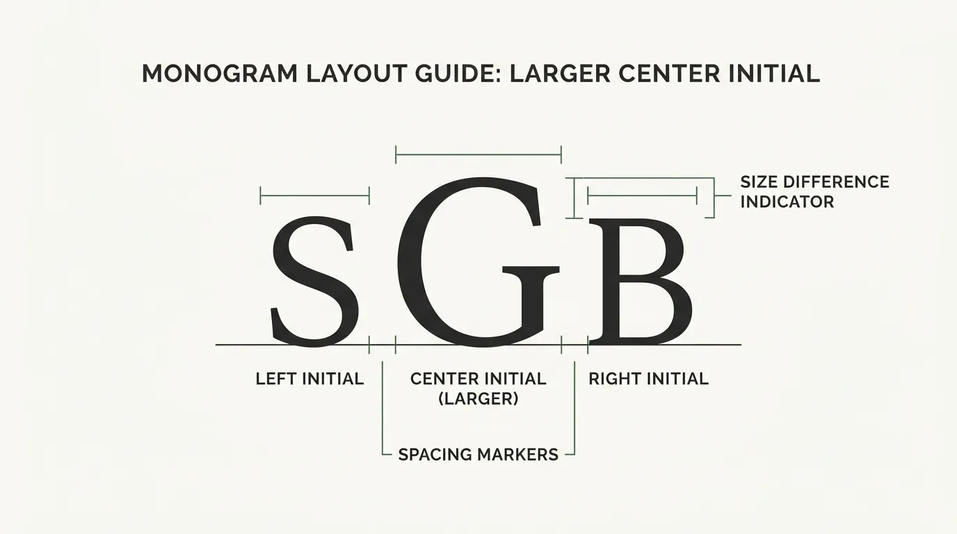
For a traditional couple’s monogram, the order runs bride’s first-name initial on the left, shared last-name initial in the center, and groom’s first-name initial on the right, and the center letter is usually set a bit larger than the two flanking it to signal that it’s the shared, unifying element. A single-person monogram, for a gift or a personal logo mark, more commonly runs first, middle, and last name initials left to right at an even size, though there’s no strict rule against making the last-name initial slightly larger there too.
For spacing, keep enough breathing room between the three letters that each one stays individually legible, especially if the font isn’t built for interlocking. A tight kerning setting that works fine for a full word usually needs to be opened up when there’s only three characters carrying the whole design, since there’s no surrounding text to visually anchor the letters together. Get the order, size, and spacing right once, and the same layout works on a logo, a wedding invitation, or a personalized gift without redoing the math each time.
FAQ
The traditional order for a couple’s shared monogram is the bride’s first-name initial on the left, the shared last-name initial in the center (usually set larger than the other two), and the groom’s first-name initial on the right. Some couples now skip the size difference and set all three letters the same height, especially with a modern sans-serif or a single combined-surname format.
A geometric or classic serif with a distinct, simple silhouette usually works best, because a single-letter mark has to be recognizable at a glance and at very small sizes, like a favicon or a social avatar. Avoid scripts or heavily decorated display fonts for this specific use since their detail tends to disappear once the letter is reduced.
Yes, but it’s common to pair a more structured or decorative font for the monogram mark itself with a plainer, highly legible font for supporting text like a business name or tagline, so the monogram can stay the focal point without competing against body copy.
A true monogram font should cover the full alphabet since any combination of initials needs to be possible, but always check the specimen or character map for a given font before buying or downloading it, since some decorative “monogram-style” fonts only ship a partial set of stylized capitals.

Related reading
- Wedding Fonts: Invitations, Full Suites & Save-the-Dates (fitting a monogram into a full invitation suite’s font system)
- 12 Elegant & Luxury Branding Fonts (pairing a monogram mark with a full brand’s supporting fonts)